The infographic is one of the most effective mediums content marketers have at their disposal. It's a format that allows you to create content that's compelling and compulsively shareable without sacrificing utility and thoughtfulness.
But there are some cases where normal infographics just don't cut it. So what can you do to elevate them? Is there a way to make them that much more gripping and intriguing? If you're asking yourself those questions, you might want to consider making your infographics interactive.
Here, we'll go over what an interactive infographic is, learn what it takes to make one, see some examples, and review some of the programs you can use to make one of your own.
In many respects, interactive infographics are a big part of the future of informational content. According to research by DemandGen, 85% of B2B marketers are already using or plan to use interactive infographics as part of their strategy.
But why is that the case? Why are companies so interested in incorporating these kinds of infographics into their content marketing strategies? Well, simply put, interactive infographics are more compelling than static ones.
They add a more immersive element to the medium and, in turn, drive greater engagement. Interactive content can also help express and promote a brand voice and identity. A study by the Content Marketing Institute found that 75% of marketers agree that non-gated interactive content can provide a "sample" of the brand, resulting in a higher degree of lead nurturing.
Ultimately, you can rope readers in by letting them directly interact with your data, they'll be more inclined to learn and retain the information you're sharing. That often translates to sincere interest in your business as a whole.
How to Make an Interactive Infographic
1. Gather and compellingly convey your data.
The first step to creating an interactive infographic — along with virtually any kind of informative content — is gathering data. An interactive infographic without interesting data is more or less a pretty picture with some information.
Once you have your data on hand, try to find a way to convey it with some oomph. A dry infographic isn't going to drum up the kind of enthusiasm or engagement you're looking for. See if you can tell a story with your information. Be intentional and interesting with the language you use.
Take a look at this example:
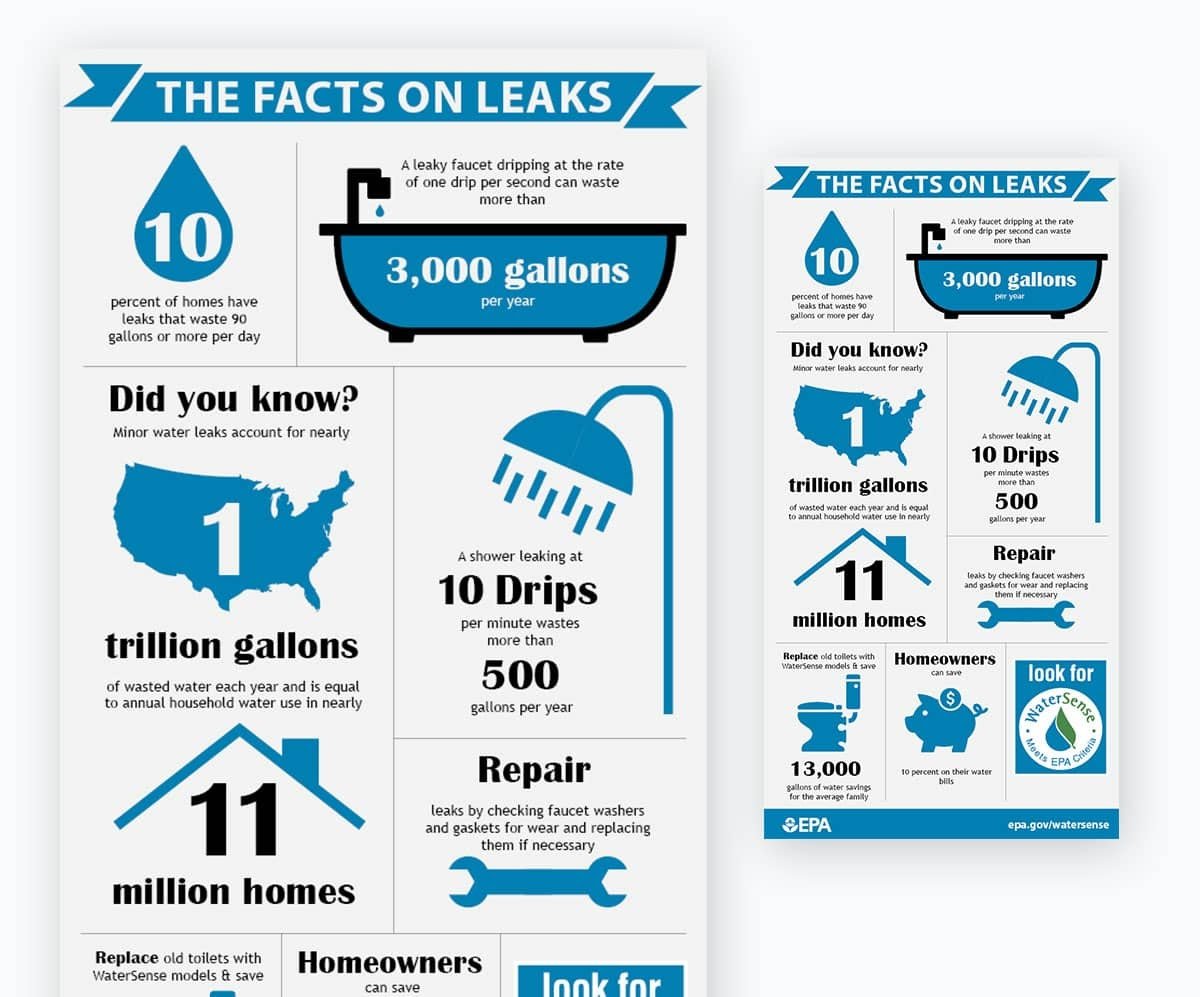
Whoever made this graphic managed to incorporate hooks, powerful language, and a cohesive theme to articulate their data and what it entails — making it more compelling, engaging, and readable than it would've been if they just threw out a laundry list of hard statistics.
2. Organize your data with compelling visual elements.
The operative term in the phrase "infographic" is "graphic". Visual elements separate this kind of content from bland lists of facts or statistics. When making an interactive infographic, you need to incorporate interesting visuals to spur and sustain the interest that will keep people engaged with your content.
Find relevant, eye-catching images to supplement the data you're trying to relay to readers — whether they be actual photos, illustrated graphics, or any other kind of engaging visual. The key here is to abide by a consistent theme.
That means maintaining consistency in the color, tone, and visual medium you decide to go with. Breaking up that kind of cohesion can be jarring and turn some readers off.
3. Determine and apply the interactive elements you'd like to include.
Finally, once you've pinned down the written and visual themes you want to use to convey your data, you need to identify and apply the interactive elements that can best complement and enhance them.
If you want readers to test their knowledge of the subject you're covering, consider using a quiz. If you'd like to show them how your data might impact them personally, try including a survey. If your data covers physical landmarks or geographic data, think about including a heat map.
There are tons of interactive elements you can choose to make your infographic pop. Just make sure the ones you decide to include are engaging and appropriate without being too jarring. They need to be relevant to the information the infographic covers and tailored to keep readers hooked.
Interactive Infographic Examples
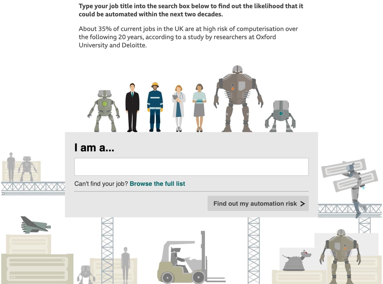
BBC's "Will a Robot Take Your Job?"
This interactive infographic from BBC addresses the future of work and automation. It allows you to enter your line of work into a survey field and uses compelling, fun graphics to detail the degree to which your field will be automated in the future.
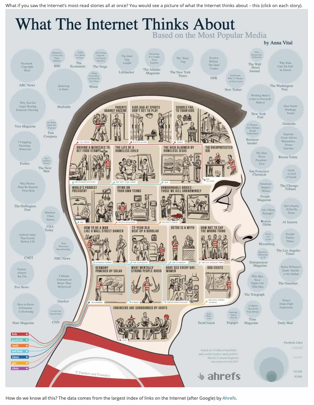
Adioma's "What the Internet Thinks About"
This infographic from Adioma links out to a variety of popular articles that capture the essence of what kind of content most people on the internet are thinking about.
National Geographic's "New York City Skyline"
This infographic from National Geographic provides a seamless, interactive view of the New York City skyline, along with some information about the individual buildings that compose it.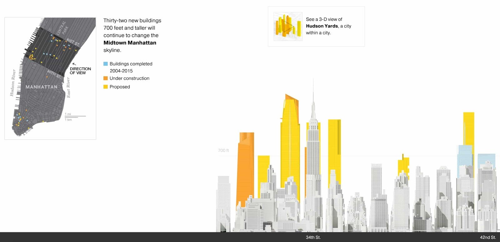
QZ's "Dude Map"
This infographic is a fun heat map that details the names men use to greet each other by region in the United States.
1. Infogram
Infogram is one of the preeminent resources for creating interactive infographics. The program's suite of interactive features is robust and eclectic — including elements like interactive chart legends, timers, and interactive maps.
The software is particularly user-friendly. It has an accessible interface and a host of straightforward, seamless integrations — users can smoothly translate data from spreadsheets into well-crafted, engaging interactive infographics.
Infogram's pricing structure includes free plans for smaller operations and reasonably priced tiers available as your organization's graphic needs expand.
2. VisMe
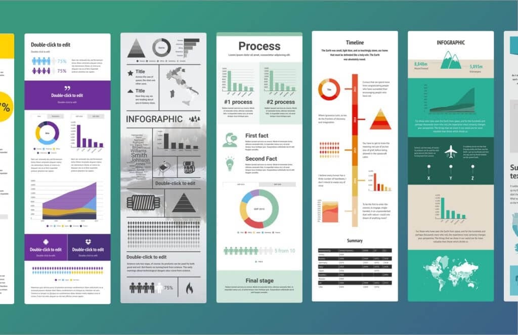
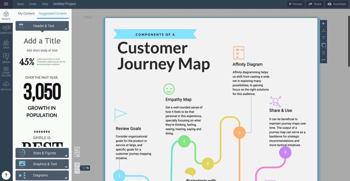
Visme is one of the foremost online design software for non-designers. The program includes resources for first-rate presentations and infographics. And while its static infographic creation features are cutting edge in their own right, Visme sets itself apart from similar software with its interactive infographic capabilities.
The software lets you easily incorporate interactive elements like links, quizzes, videos, and surveys into your infographics. And as I mentioned, Visme is tailored to suit the needs and skillsets of non-designers, so if you're looking to put together compelling interactive infographics with limited design experience, consider giving VisMe a shot.
VisMe offers a free plan to let users get acquainted with the software and appropriately priced plans for everyone from individuals to enterprises.
3. CopyPress
Creating interactive infographics isn't always intuitive. It can be a complex process to nail. In some cases, you might want to outsource that work to an esteemed, effective creative agency. If your needs fit that bill, you might want to get in touch with CopyPress.
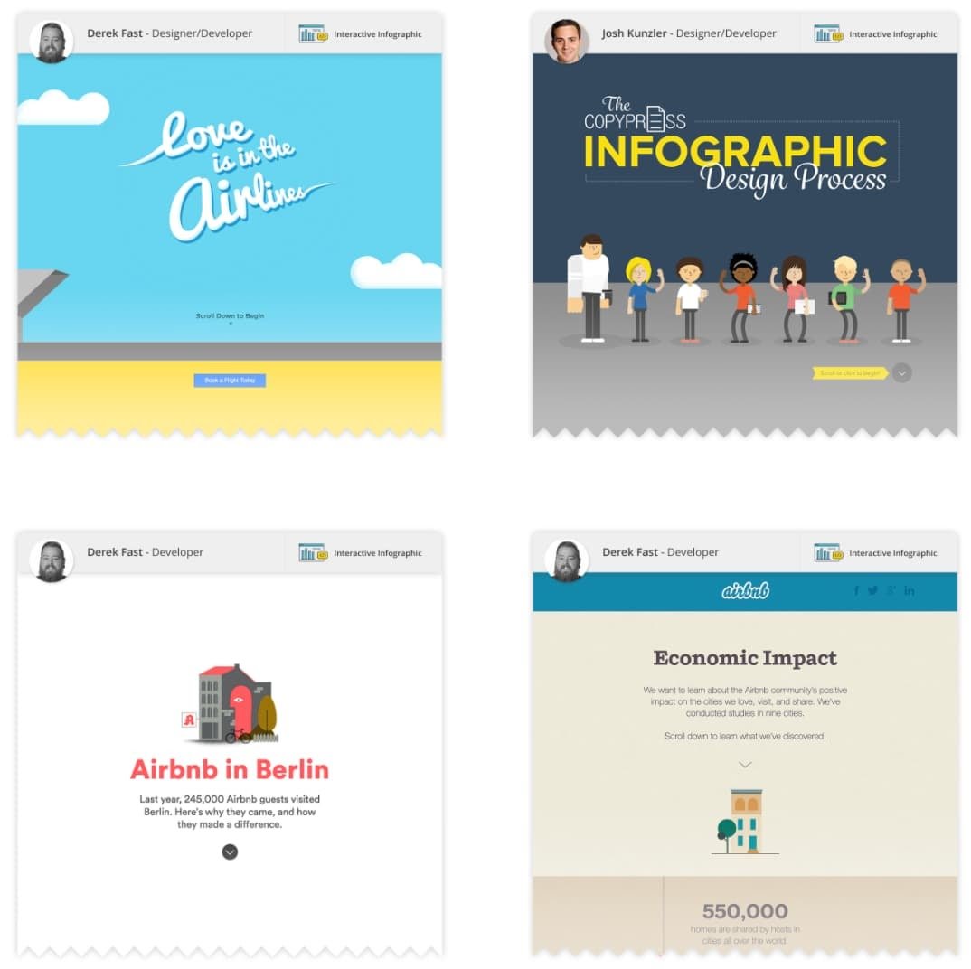
CopyPress can apply your research, work with you to pin down a tone that fits your specifications, and translate both into engaging, thoughtful interactive infographics. The firm even has an interactive infographic about how it makes interactive infographics.
As you can assume, this is one of the pricier roads to take, but if you want your interactive infographics to be thorough and professional, it might be the right way to go.
The interactive infographic is a format that can capture and retain consumer interest when done right — an emerging medium that's worth some time and consideration when you're wondering where to go with your content marketing. Creating one often takes a lot of effort, but if you're looking for an effective way to compellingly convey hard data and quickly hook consumers, it might just be worth it.

