

Every great brand needs a great image, something striking, memorable, and most of all, consistent. With that in mind, ensuring that your content stays on brand wherever it lives can be tough, but having a brand style guide is a huge help!
Think of a style guide like a rulebook that makes sure your content stays on brand every time it reaches consumers. From a solid mission statement all the way down to the color and font choices of a logo, everything works together so that your consumer can instantly identify with it and make a purchase.
The best part is that tons of brands post their style guides online for you to learn from, so if you’re curious to see how the industry leaders do it, check out these 5 examples of awesome style guides from some of your favorite brands:
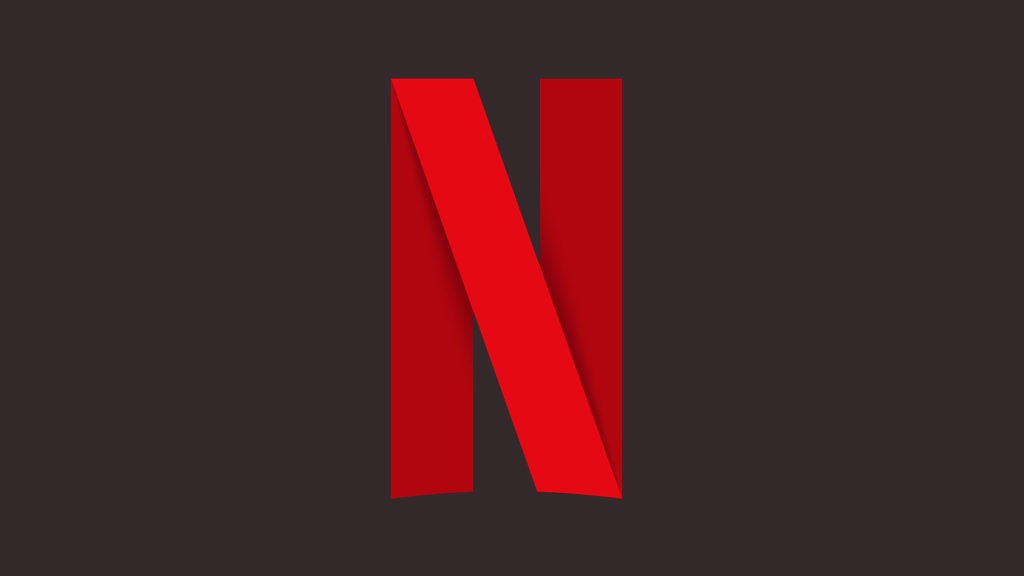
1. NETFLIX
Curvy red letters on a white or black background make up the Netflix logo. In their guidelines, they focus a lot on logo usage and making sure it always remains easy to read. For instance, when using a white Netflix logo, they only feature it as a burn-in watermark in the right-hand corner of the screen. Their primary logo use is the signature red font color over an egg-shell or off-white background, which creates a simple, no-frills look. As for their symbol, they have a specific color and size dimensions that make their identity unique, bold, and friendly.
Netflix likes to keep their image clean. They even ask that you don’t use their logo on doormats!

2. NASA
At first, you might not think of NASA as a brand that takes their image seriously, but you’d be wrong. The truth is, the style guide for NASA is an entire book!
They focus on attention to detail and are serious about what they do. There are even guides on where to place patches on garments down to the square inch, which makes sense for rocket scientists! Using only shades of royal blue against whites and grays, they communicate simplicity and direction. As leaders in their field, they are as poignant with their visuals as they are with their discoveries, and you can see it in their well-organized and thought out guidelines.
In fact, the NASA brand guide was so well done it became a coffee table book that you can buy online!
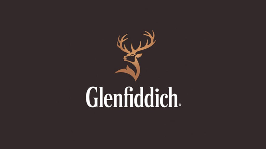
3. GLENFIDDICH
If you don’t drink scotch, you may not have heard of Glenfiddich before, but their style guide leaves nothing out!
The Glenfiddich brand guidelines include the history of their logo and even explain how they created their own font based on the handwriting of the original founder. Like a fine whiskey, they incorporate tradition while focusing on individuality. These kinds of details give their brand a uniqueness and authenticity. When you look at their label, the striking gold embossing and proud twelve-point stag work to capture longevity and elegance.
Glenfiddich aims to make a storied image that is built on distinct and subtle details.

4. WEWORK
WeWork is all about community and so are their guidelines.
WeWork uses a brand system that is all about helping people share. To keep their image consistent, they incorporate a ton of beautiful and downloadable content that focuses on visuals, language and tone. There are videos, illustrations, and even an interactive experience! They also work with graphic designers and journalists to explore and foster their community with articles and images that touch on things like urban development and environmental crises.
WeWork is a great example of how brand guidelines can do more than just outline visuals—good job guys!

5. SPOTIFY
Audio-streaming service, Spotify, uses a bright green logo that you can’t forget! They call it Spotify green.
Because they work with app developers, the Spotify style guide is made to help integration. That means it outlines the use of the logo and how to place it on images with specific color combinations for each type of application. For example, use of the logo without the watermark can only be found where the brand is already established. Also, it can only feature on a white or black background. Plus, they make it easy to add the logo with a custom widget builder for all social platforms.
Spotify makes it straightforward, and that goes a long way in the world of marketing where things are often stylized.
There a lot of ways to communicate your brand image. No matter what you want to say to your consumer, staying consistent and memorable is the key to standing out. So, when it’s time to start marketing your brand image on a wider scale, research some companies you love to get your brand guidelines done right!
The post Brand Guidelines Done Right: 5 Examples of Awesome Style Guides appeared first on .