
Whether it’s an explainer on solar panels or the farm-to-cup process of making your favorite coffee, infographics compress a world of information into one simple, digestible format.
But designing an infographic that successfully communicates a lot of information in a simple visual format requires more than a quick idea and a template.
Fortunately, there's one design element that the best infographics all have in common, and it can help you build a professional infographic that gets your point across and looks good doing it.
Icons are the secret tool that designers use to take your eye from one point to another so that all that information comes to you in just the right order.
Icons form the secret language of infographics, and once you learn how to speak it, yours will be more effective and (hopefully) widely shared by your audience.
Why Do You Need Infographic Icons?
Infographics can be a great source of information when you’re introducing a complex topic to an unfamiliar audience. People love sharing them because they can communicate a vast quantity of information in an elegant, easy-to-digest format.
However, it’s easy to create an infographic that is overwhelming or which simply falls flat. Icons streamline the process of creating the infographic and ensure that it effectively communicates the information it’s meant to share.
Infographic icons give structure to your infographic and can be used to highlight key pieces of information. They can also efficiently explain what happens at important junctures of the process without relying on words. You have a limited amount of space on an infographic, and icons help you say more with fewer words.
6 Reasons To Use Icons in an Infographic
1. They help your audience focus.
A good infographic is a buffet for the eyes, and your readers could have trouble focusing on just one part of it at a time. Icons provide a much-needed sense of structure to the information in your infographic and create a guided experience for the viewer. Good icon placement makes navigating your infographic a more intuitive experience for your audience.
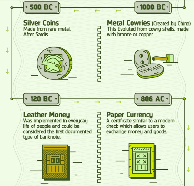
In the excerpt of an infographic from Infographic Journal that covers the entire history of currency from 9000 BC to the present, the author uses icons to mark key events and add interest to what could have easily been a boring timeline. Small (but important) arrow icons along the timeline also keep the reader moving along in the right direction.
2. They make the words you use count more.
Want to make your text stand out on your infographic? Try pairing it with an icon. It’s easy for your words to get lost among the visuals of your infographic.
Icons can bring attention to specific words or charts, and help the viewer leave with clearer, more memorable takeaways. They can also tip off the reader what to expect from each section, allowing them to focus on the subjects that interest them first.
In this excerpt of an infographic from Futurism.com, complex concepts (that could have each required a lot of text to explain) are accompanied by custom icons that help reinforce the titles of each section with fewer words.
You might not immediately know what "ingestible robots" means, but when you see the image of the robot popping out of a pill capsule, you get a better grasp on it immediately.

3. They make data easier to understand.
Graphs displaying complex information can be challenging for many people to grasp at first, but a simple icon can prime your audience to understand the data it presents and why it matters to them.
For complex graphs, multiple icons can break down individual sections and allow the audience to derive more value from it, making it more likely they share it with their networks. You can also use icons to represent amounts in a graph instead of raw numbers to make them easier for your audience to grasp.
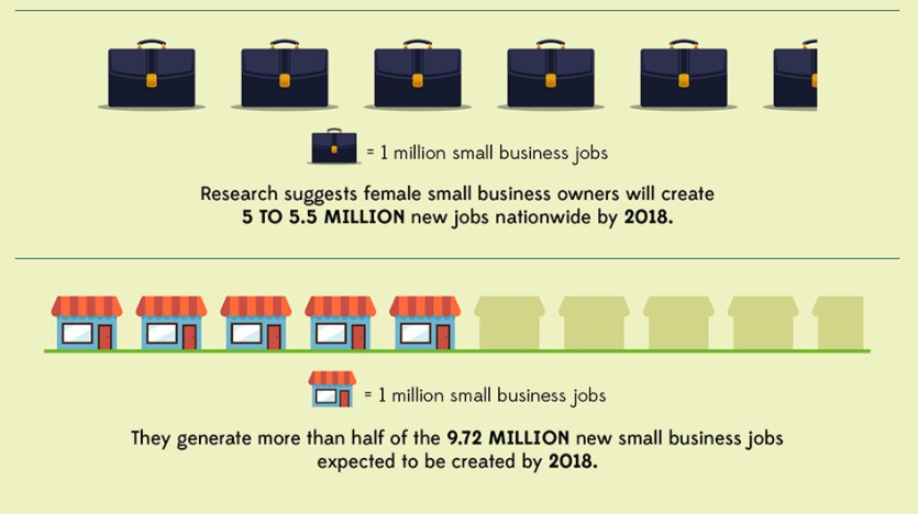
In this excerpted screenshot of an infographic from USC Marshall School of business, icons are used to convey data in place of a more traditional graph:
4. They can help you say more with less.
Icons are an ideal medium for telling a simple story that hits on the main theme of your infographic. This can form a unifying message that allows your target audience to connect with the information presented.
Your infographic’s data tells a story, and icons can show it to your audience immediately. From cave paintings to fire exit signs, icons can be used to create powerful, engaging stories with the simplest of shapes.
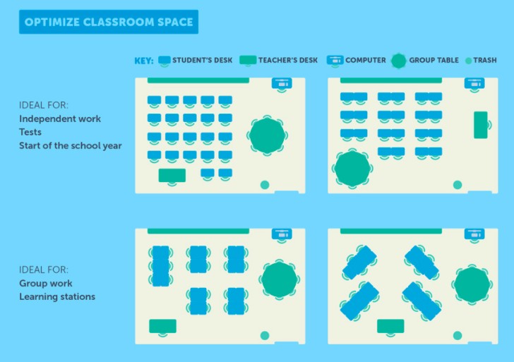
You can get a feel for how icons can effectively communicate complex pieces of information in the except of an infographic from USC Rossier on the science of classroom design. Describing each of these classroom formats would have been cumbersome and required a lot of text, but with icons, a lot of information can be condensed in a simple visual.
5. They tap into shared meanings.
The best thing about icons is they often mean the same thing in every context they’re used. This allows you to introduce meaning into your infographic without having to explain it to your audience directly (and take up valuable space on your design). This ultimately makes your infographic more accessible and easier for your audience to understand.
In the infographic excerpt from Daily Infographic below, the designer makes excellent use of two instantly recognizable symbols -- money and people -- to explain the evolution of crowdfunding.

6. They contribute to your brand's personality and voice.
The icons you choose can add personality to your infographic and are an excellent opportunity to showcase your branding.
What do cute, fun, icons, or hand-drawn ones say about your brand or the information you’re providing? What about sleek, polished ones? The aesthetic you choose for your icons is just as important as any other piece of information you choose to include in our infographic.
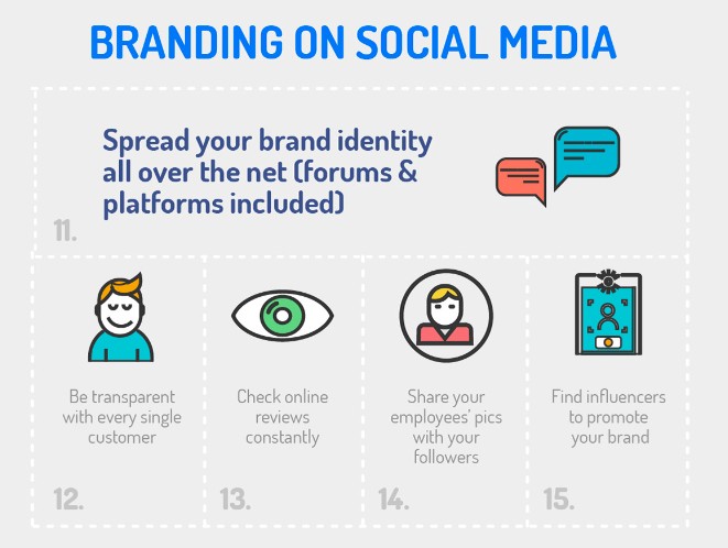
In the example below from Printsome, a company that specializes in printing and design, it makes sense that the creator chose to use a clean, consistent icon aesthetic that fits in neatly with the branding of their website.
The Best Free (and Almost Free) Resources for Infographic Icons
There’s a wide variety of free and nearly-free sources for infographic icons and elements online. We’ve listed some of them here for your next project.
Flaticon
Looking for free vector icons created by a wide variety of designers? Flaticon is a great place to begin your search. With 3,641,000 (and growing) free vector icons available on the site, this site is a solid option if you have a specific design in mind and a limited budget.
Icons8
If you're looking for a more curated selection of options, Icons8 offers free icons that are designed entirely by a single team. This is a great option if you have plans to create a series of infographics and want a consistent look between all of them, regardless of the subject matter.
Noun Project
Noun Project believes icons help create an important global language, and their unique (and extensive) collection includes more specific options -- we're talking everything from icons representing abstract artificial intelligence concepts to Beyoncé -- that you likely won't find anywhere else on the web.
DaFont
If you've ever sought out free fonts on the web, you've probably encountered DaFont -- but did you know they also have a solid selection of icons? If you'd prefer to use icons in custom font format instead of downloading them as images, DaFont is a good free option.
Iconshock
Most of Iconshock's library is free to use for noncommercial purposes. If your infographic is for commercial use, you’ll pay a one-time fee for most icons here, which is a budget-friendly option if you're still testing out infographics as a marketing strategy.
Iconfinder
Iconfinder offers a nice balance of extensive options with some expert curation -- which is a bonus if you're not interested in filtering through hundreds of pages to find icons that fit your ideal aesthetic. Most icons featured here are available for free for personal use, while pricing plans are available if you plan on using any of the icons commercially.
Behance
Behance is a platform where designers around the world can showcase and sell their design work and connect with potential clients -- but many generous designers also offer some design goodies for free. If you're willing to spend some time searching, there are certainly some hidden gems on Behance that are worth the search.
Icons give your infographics shape.
Icons are vital tools that can bring meaning and structure to your infographic while enabling greater word economy in your overall design.
They can help to orient the viewer to the information and provide cues that indicate the flow of the infographic. Even if your viewer is completely unfamiliar with the information in your infographic, icons with a widely-recognized meaning can help to improve their understanding of it.
Ultimately, the icons you choose for your infographic and the way you use them can improve its overall utility for your viewer.