
It can be difficult (if not impossible) to create a brand that remains fresh, relevant, and inspiring years — or even decades — post-creation.
Just consider Dunkin' Donuts: the brand, first established in 1973, recently shifted its focus to coffee — and, to demonstrate the shift, dropped the 'Donuts' in the name.
The rebrand makes sense. Dunkin's consumers' preferences, tastes, and style have likely changed quite a bit in the roughly 50 years since the first Dunkin' was introduced. Dunkin' needed a rebrand to ensure its business could grow with its consumers, or risk falling behind.
A rebrand can successfully re-establish your brand in an industry, help expand your product offerings, or attract new consumers. But it's not as simple as copying-and-pasting a fresh logo onto your homepage.
A good rebrand demands redefining your company's vision and values, re-establishing your brand's audience, and rebuilding your brand identity from the ground up.
Fortunately, if your business is considering a rebrand, you're in luck. Here, we've compiled five successful examples of rebrands to help inspire your own efforts. Use these examples to kickstart your own rebrand in 2021.
Five Successful Examples of Rebrands
1. Petco

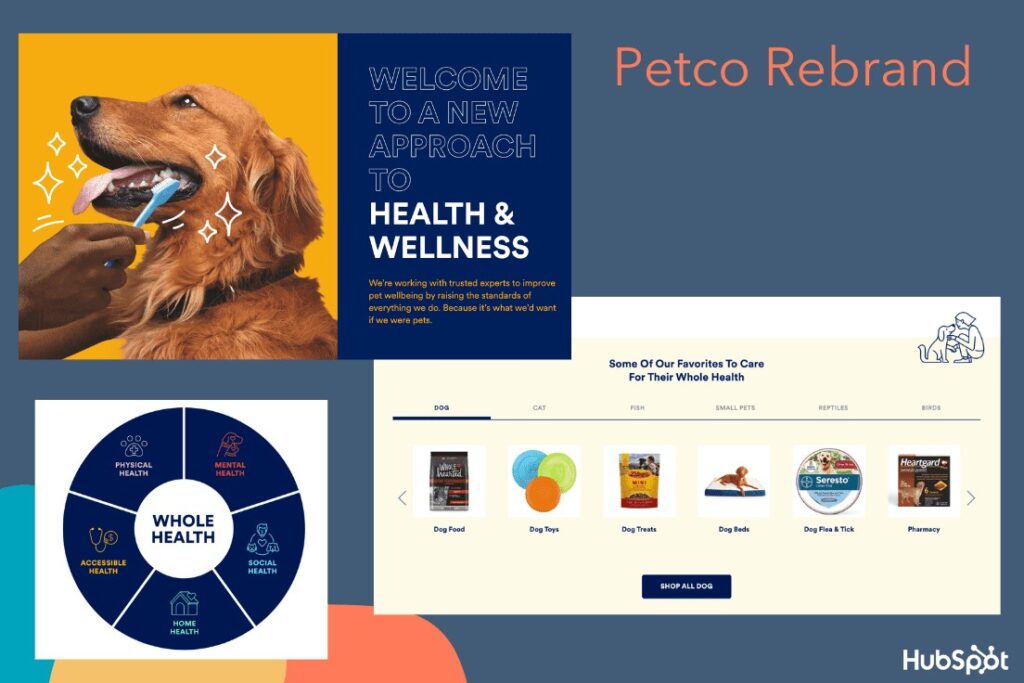
In October 2020, Petco released an announcement declaring it would no longer sell electronic "shock" collars. The announcement was used to highlight the company's rebranding efforts — the pet store, which is over 50 years old, was officially rebranding itself as a health and wellness company for pets.
The pet store redesigned Petco's homepage, as well as the Petco app, to focus on their new initiatives — including health and wellness resources for pet parents, a "Right Food Finder" tool to help parents identify the healthiest foods for their pets, and an extended range of pet healthcare and insurance offerings.
The company also redesigned their logo, opting for a simple blue-and-white design over their previously-signature red and blue cat and dog (to mixed reviews).
Nowadays, many American pet owners treat their animals as members of the family — so Petco's rebranding makes a lot of sense. The company aims to use the new branding to re-establish itself as the leading health and wellness brand for animals.
The new design better reflects the brand's more holistic approach to animal wellness — including a dedicated landing page that outlines how to take care of your pet's mental, physical, and social health, with a tagline, "We're working with trusted experts to improve pet wellbeing by raising the standards of everything we do. Because it's what we'd want if we were pets."
Overall, this was an extremely successful rebrand as it focused on a shift in consumers' lifestyle and preferences, and ensured the company's refreshed vision reflected those priorities.
2. Adobe Creative Cloud
In May 2020, Adobe released a blog post titled, simply, "Evolving Our Brand Identity". The article dives into the decisions behind Adobe Creative Cloud's rebranding, and states, "We're making these branding changes to ensure our portfolio continues to be easy for our customers to navigate and understand, as well as maintain a fresh look and feel."
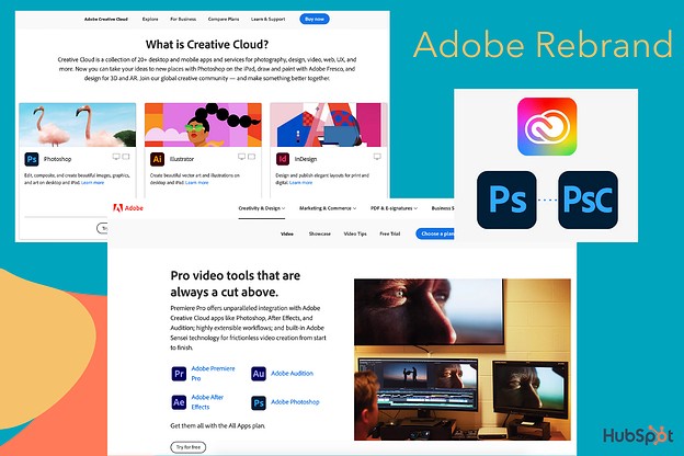
Among other things, Adobe Creative Cloud redesigned:
- Its company logo. The company redesigned the logo to an all-red logo with warmer hues.
- Its Creative Cloud logo. The new logo uses a colorful, rainbow-esque gradient to represent "the importance of creativity". The colors in the logo are pulled together from various Adobe products, as well as the new Adobe red logo.
- Its product logos. The company is adding 3-letter mnemonics to help viewers determine product families — i.e. Adobe Photoshop (Ps) and Adobe Photoshop Camera (PsC). The designers also used colors to organize products into categories.
- The corners of all logos. The corners are now rounded to fit across a variety of devices and operating systems.
These redesigns successfully highlighted and organized the many product offerings of Adobe Creative Cloud. For instance, when you navigate to the "Video" product page on Adobe's website, you'll see all apps within the Video category are similar shades of blues and purples.
While some designers have expressed frustration over the new logo color similarities, it makes sense that the brand felt it necessary to organize their products better — with a catalog of over 50 products, it can feel overwhelming to choose the right ones for your needs. The updated logos should help make it easier to pick-and-choose.
3. Starbucks
Over the years, Starbucks — one of the most valuable brands in the world — has proven the true power of a good brand. And one of the telltale signs of a good brand is the ability to consistently innovate and push the boundaries, rather than settling for what's already working.
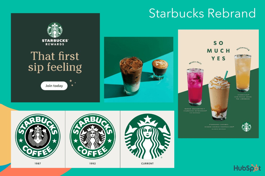
In 2020, Starbucks released its "Starbucks Creative Expression" brand expression guide. Among other things, the site focuses on Starbucks' defined voice, typography, and logo in an effort to create consistency across channels and Starbucks locations.
In a few words, Starbucks aims to create a brand that is open, creative, carefree, and modern. On the Voice page, for instance, it reads, "We're confidently turning down the volume of competing messages to elevate experience, removing obstacles in the way of people finding exactly what they seek at Starbucks."
"By using both functional and expressive voices, we'll create more space for brand relevance, connection and joy."
The guideline adds, "When we have the space, we tell a passionate coffee story. But even with just a few words, our copy can make you smile."
Similarly, Starbucks recently rebranded its logo to the simple Siren logo without the "Starbucks Coffee" wordmark wrapped around it. The company notes, "The preferred approach is to use the Siren logo by itself, unlocked from the wordmark. This allows flexibility to present the Siren with greater prominence while maintaining a considered, open and modern presentation."
Ultimately, this most recent Starbucks rebrand is simple and effective. Rather than moving too far in the opposite direction of the brand's roots, the company sticks to its fundamental company vision while making slight alterations to continue serving the needs and preferences of its consumers.
4. GoDaddy
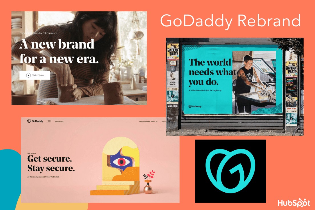
A web hosting service founded back in 1997, GoDaddy was in need of an upgrade. In early 2020, they did just that, creating a brand-new logo, refreshing their website design, and creating new marketing campaigns to match the new look. Their design page reads, "A new brand for a new era" and focuses on how GoDaddy's users — the everyday entrepreneurs — inspired the new look.
One of GoDaddy's most striking changes is the new logo, named the GO. GoDaddy believes the GO represents "the indomitable spirit of everyday entrepreneurs … joy that entrepreneurs everywhere experience … and [a] continuous, overlapping stroke [which] symbolizes the connection all entrepreneurs share."
GoDaddy's new design uses bold, colorful visuals, hand-drawn illustrations, and a bold, serif font evokes a sense of inspiration and joy. GoDaddy's brand voice, depicted in recent campaigns, aims to be casual, human, and friendly.
While some brands might need less of a full makeover, GoDaddy's older image felt outdated and less cohesive. Their rebranding reflects the modern tastes, personalities, and needs of the GoDaddy's user in 2020.
5. Pottery Barn
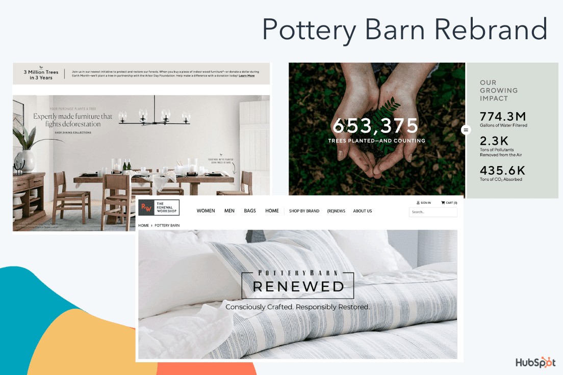
This last example is a subtler, more internal rebrand than the others in this list, but equally important. Pottery Barn, a roughly 70-year-old home furnishing company, has now put sustainability as the central focus of their brand, promising consumers that what they purchase will be worthwhile — both in terms of quality, and in terms of environmental impact.
Pottery Barn, named the most sustainable home furnishings retailer, has focused its efforts on sustainability with a dedicated landing page outlining its commitments.
Among other things, Pottery Barn promises to:
- Plant a tree (with the Arbor Day Foundation) every time a consumer purchases a piece of indoor wood furniture.
- Reach 100% responsibly-sourced cotton by the end of 2021.
- Keep products out of landfills by restoring items with a new Pottery Barn "Renewed" line.
- Contribute money for communities to invest in health clinics, water filtration systems, and more (the brand has currently contributed $3 million).
While this focus on sustainability isn't brand-new for Pottery Barn, its recent efforts are more hyper-focused on it than ever. Consider, for instance, how this detailed Fast Company article about Pottery Barn's style, published in 2003, doesn't mention sustainability once.
The article also highlights how, more than 20 years ago, Pottery Barn used to purchase merchandise from outside vendors and assemble into a collection — this lack of ownership likely made it difficult to ensure sustainable products. Additionally, Pottery Barn announced its partnership with the Renewal Workshop in September 2020.
Ultimately, as your brand grows with your consumers, it's important to take into account what matters to them today. Pottery Barn has done an excellent job identifying a sweet-spot in the furniture marketplace: Sustainability. As consumers continue to use this value as a guiding light in their purchasing decisions, it makes sense for Pottery Barn to ensure all their updated marketing materials reflects this mission.
Rebranding Takeaways for Marketers
When you take a look at the examples listed above, it can be easy to spot some similarities that made them all strong contenders for best rebrands.
If you're considering a rebrand for your own business, here are a few takeaways:
- Keep your audience at the forefront of your plans. What tastes and preferences do they have? What inspires or excites them? How would they want your website designed?
- Use your consumers' outside preferences to shape your rebranding. What passions do your consumers have beyond your products or services, and what do they care most about — can you weave those into your brand story, similar to how Petco focused on animal wellness and Pottery Barn focused on sustainability?
- A rebrand is more than just a logo change. To properly rebrand, you'll want to conduct a content audit and analyze all your existing content to ensure each webpage, graphic, and advertisement is updated to fit your new image.
- A brand guideline page is critical for cohesion. Most examples in this list have a dedicated brand guideline page for ensuring each employee is empowered with the right tools to create content that fits the new look. Both GoDaddy and Starbucks, for instance, outline how the voice should sound, what fonts to use, and even what colors to include in any public-facing marketing materials.
Ultimately, a rebranding strategy can be an exciting and effective opportunity to delight existing customers while attracting new ones. Use the takeaways listed above, as well as inspiration from examples in this list, to get started with your own fresh look for 2021 and beyond.