

We've all heard how important it is to make a good first impression. Show up late for a job interview?
That's a bad first impression. Eat a ton of garlic and forget to brush your teeth before a first date? Also a bad first impression.
It turns out that the "make a good first impression" principle holds true not only in face-to-face encounters, but in email interactions as well.
When you send a welcome email to a new blog or newsletter subscriber, or to a new customer, you're making a first impression on behalf of your brand. To help ensure you're making the best first impression possible, we've rounded up some examples of standout welcome emails from brands big and small.
Pro Tip: Use HubSpot's free email marketing software to easily create a high-quality welcome email sequence like the ones featured below.
As you'll soon discover, each example below showcases different tactics and strategies for engaging new email subscribers. Let's dive in.
10 Examples of Standout Welcome Emails
1. Virgin America
Type of welcome: Get Started

A welcome email is the perfect medium for introducing folks to the characteristics (and eccentricities) that make your brand unique.
For Virgin America, that means putting the "I love you" hand symbol front and center. This small gesture signals to the recipient that the folks atVirgin America really care about their customers. The playful accompanying copy, "Welcome aboard," and casual call-to-action, "Grab a seat," also help to position Virgin America as a hip, fun-loving brand right off the bat.
2. Food52
Type of welcome: Get Started

Sometimes the tiniest of elements in a welcome email can speak volumes about a brand. And when it comes to Food52's welcome email, their preview text at the top of the email, "We brought snacks," definitely accomplishes this.
Also known as a pre-header or snippet text, preview text is the copy that gets pulled in from the body of an email and displayed next to (or beneath) the subject line in someone's inbox. So when you see Food52's welcome email in your inbox, you get a taste of their brand's personality before you even open it.
Food52's welcome email also does a good job of building trust by putting a face (make that two faces) to their name. As soon as you open the email, you see a photograph of -- and welcome message from -- the company's founders.
3. Monday.com
Type of welcome: Video
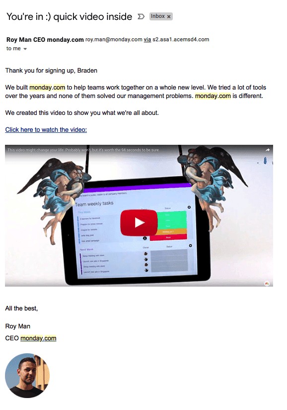
From the subject line to the conversational tone in the email body, the welcome email above keeps it friendly and simple so the focus stays on the introductory video inside.
Monday.com is a task management tool for teams and businesses, and the welcome email you get when you sign up makes you feel like the CEO, Roy Man, is talking directly to you. The email even personalizes the opening greeting by using the recipient's first name -- this is well known for increasing email click-through rates (especially if the name is in the subject line).
The closer you can get to making your email sound like a one-on-one conversation between you and your subscriber, the better. If you have just so many details you need to inform your new customer of, follow Monday.com's lead and embed them in a video, rather than spelling them all out in the email itself.
4. Kate Spade
Type of welcome: Thank You

Let's face it: We, the internet-using public, are constantly bombarded with prompts to sign up for and subscribe to all sorts of email communications. So as a brand, when someone takes the time to sift through all the chaos in order to intentionally sign up for your email communications, it's a big deal.
In order to acknowledge how grateful they are to the folks who actually take the time to subscribe, Kate Spade uses a simple -- but effective -- tactic with their welcome emails: They say "Thank You" in big, bold lettering. And by placing that "Thank You" on an envelope, Kate Spade recreates the feeling of receiving an actual thank-you letter in the mail. (The 15% off discount code doesn't hurt either.)
5. Lyft
Type of welcome: Get Started
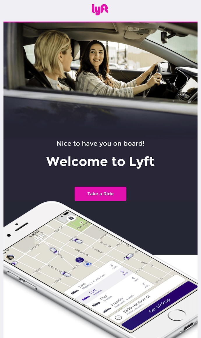
If there's an ideal "attitude" that welcome emails should give off, Lyft has got it.
The company's simple but vibrant welcome email, shown above, focuses entirely on the look and feel of the app, delivering a design that's as warm and smooth as the lifts that Lyft wants to give you. At the same time, the email's branded pink call-to-action draws your eyes toward the center of the page to "Take a Ride" -- inviting language that doesn't make you feel pressured as a new user.
6. IKEA
Type of welcome: Offer

It might not be the most beautifully designed email on this list, but that doesn't mean IKEA's welcome email isn't effective.
Instead of going for the hard sell (e.g., "By stuff now!"), or explaining what it is they do (which is something IKEA probably assumes most people already know), IKEA uses its welcome email to turn folks onto its other, lesser-known programs and content channels. For example, there's a call-to-action right at the top that explains the value of its member benefits program. There are also prompts to visit their design blog and to contribute to their collaborative "Share Space" site.
Of course, if you're not interested in any of that stuff, IKEA's welcome email also makes it easy for you to simply log in and start shopping (there's a login field right up top).
7. Michaels
Type of welcome: Offer

The Michaels approach to the welcome email borrows elements from both Kate Spade and Virgin America. In addition to expressing gratitude to the folks who took the time to sign up, Michaels uses its welcome email to showcase the brand. And the company does a great job: The lengthy email feels like one big arts and crafts project, complete with paint, yarn, and chalkboards.
Another standout feature of this welcome email is that Michaels makes it immediately clear what value its future email communications are going to provide. After thanking subscribers, there's this nice bit of copy that sums it up:
"We're going to send fun stuff like DIY tips and tricks, invites to in-store events, and exclusive deals and coupons."
8. Sphero
Type of welcome: Hello
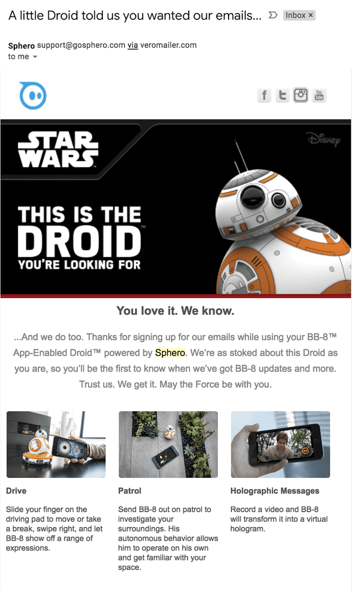
Sphero's welcome email might in fact be the cutest one we've seen recently -- and it was sent from a galaxy far, far away.
If you purchase a bluetooth-controlled BB-8, the friendly Droid from Star Wars, it was probably made by Sphero. And if it was, you'll have an email similar to the one above waiting in your inbox when you activate your new rolling companion.
This email's subject line is what qualifies it for this list -- "A little Droid told us you wanted our emails." By cleverly personifying the product, and being somewhat candid about its email marketing newsletters, Sphero develops a relationship with their recipients through the product you just bought from them.
Besides showing you how to use your new BB-8 Droid with your smartphone, all this welcome email wanted to do was say hi -- just like BB-8 himself.
9. InVision
Type of welcome: Video

When you sign up for InVision's free prototyping app, the welcome email makes it very clear what your next step should be: using the app.
To facilitate this action, InVision's welcome email doesn't simply list out what you need to do in order to get started. Instead, it shows you what you need to do with a series of quick videos. Given the visual, interactive nature of the product, this makes a lot of sense.
10. Drift
Type of welcome: Get Started

No fancy design work. No videos. No photos. The welcome email Drift sends out after signing up for their newsletter is a lesson in minimalism.
The email opens with a bit of candid commentary on the state of email. "Most people have really long welcome email sequences after you get on their email list," Dave from Drift writes, before continuing: "Good news: we aren't most people." What follows is simply a bulleted list of the company's most popular blog posts. And the only mention of the product comes in a brief post-script at the very end.
If you're trying to craft a welcome email that's non-interruptive, and that's laser-focused on adding value vs. fluff, this is a great example to follow.
Editor's note: This post was originally published in April, 2016 and has been updated for comprehensiveness.