Marketers have found that conversational experiences on landing pages (such as chatbots and live chat) convert three-to-four times more than a traditional landing page. Additionally, a report from Juniper Research predicts that by 2023, the adoption of chatbots across the retail, banking, and healthcare sectors will save businesses $11 billion annually.
So, what do these conversational experiences entail and how should chatbots be incorporated on your landing pages to increase conversions while saving your team time and resources?
Conversational Landing Pages
In this blog post, we’ll talk about what conversational landing pages are, what makes them unique, and how to create one of your own.
Let’s dive in.
Automate and scale conversations on your website with HubSpot’s Chatbot Builder Software.
A conversational landing page may also answer visitor inquiries, resolve challenges, share specific offers, and guide customers to whatever it is they need via chatbot or live chat.
If your landing page only includes a chatbot for visitors to interact with, you may customize the bot so it can detect complex issues that require the support of a human — then, the bot can direct visitors to live chat.
What makes conversational landing pages unique?
In addition to conversational landing pages, there are two other main types of landing pages that are used to engage visitors: traditional landing pages and hybrid landing pages.
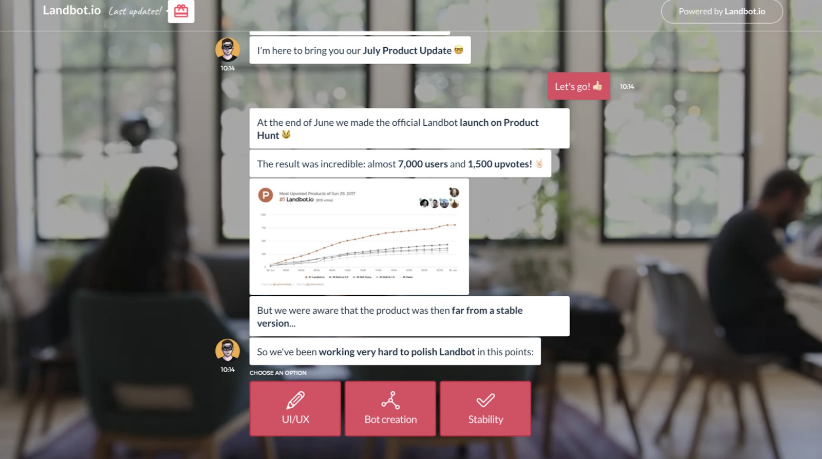
A conversational landing page looks something like this, with the chatbot conversation filling up the entire screen for the visitor:

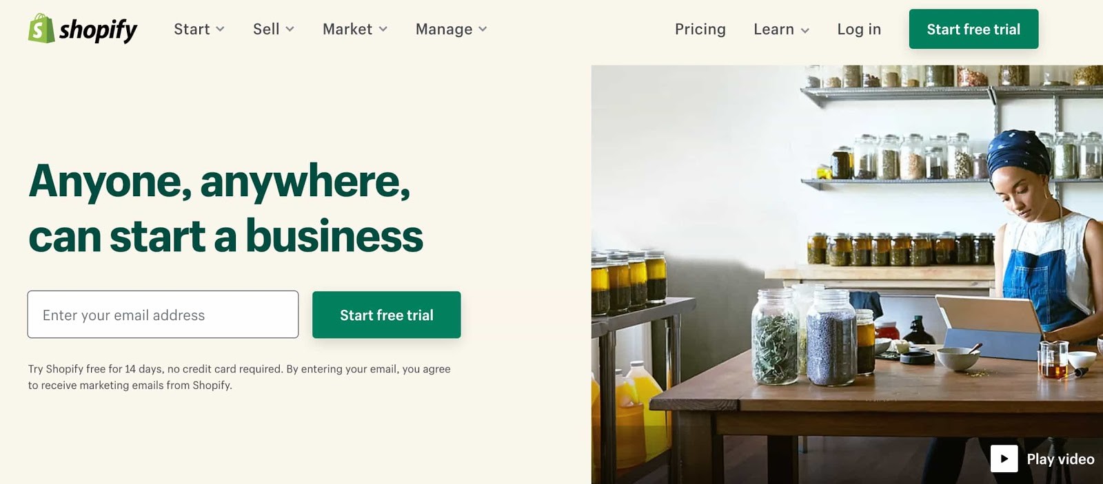
A traditional landing page is one that engages visitors with a traditional lead generation form. The lead generation form is placed among other content on the landing page. It asks for information from visitors (e.g. name, email address, zip code) in exchange for something (e.g. discount code, subscription, or trial).

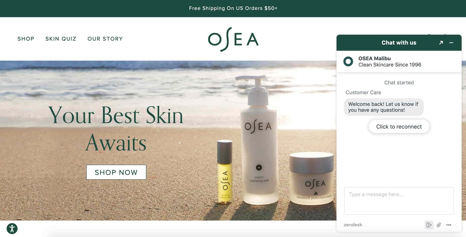
A hybrid landing page combines features from both a conversational and a traditional landing page — it’s essentially a traditional landing page with a chatbot (which can be expanded or be minimized) embedded on the page.

Now that you've seen these other two types of landing pages, you may be wondering, “Why should the chatbot/ live chat conversation be the only thing on a conversational web page?”
Fair question.
By making a contextual, chatbot conversation the only thing on a web page, you establish a personal, one-on-one feel that traditional and hybrid landing pages don't provide. This allows you to more easily promote new offers, close more deals, and increase conversion rates.
How do you create a conversational landing page?
When creating a conversational landing page, you’ll work through many of the same steps — or, at the very least, similar steps — to those you’d follow when creating any other landing page.
1. Set a goal for your conversational landing page.
The main goal of your conversational landing page is to engage visitors. But that doesn’t mean you can’t also set more specific targets for engagement if you’d like to — this is a good way to establish a single focus for your page in order to make it as effective as possible.
Here are some examples of conversational landing page goals:
- Provide highly-accessible customer support.
- Share special offers.
- Convert and upsell leads and customers.
- Get to know your audience on a personal level and apply that information to campaigns, buyer personas, sales, and more.
- Collect feedback to improve upon your product/ service, customer experience, and buyer’s journey.
2. Tailor the chatbot to your buyer personas and customers.
Your chatbot should cater to your specific audience. With a chatbot builder — like HubSpot — you can customize your chatbot and use it to qualify leads, book meetings, and create responses to FAQs. You can also configure your chatbot so that it guides an individual with a more complex reason for reaching out to live chat/ a rep. The bot can also create support tickets and add contact data to your lists and workflows to automate tasks and save your team time.
3. Use clear, action-oriented language.
The point of your conversational landing page is to engage and interact with your visitors as well as support their needs, challenges, and goals. It’d be very difficult to do this if your landing page was cluttered, unclear, hard to understand, or difficult to navigate.
So, when working to determine what text you’ll include on your conversational landing page, remember less is more — meaning, your chatbot and any other text on your page should be concise, conversational, and straightforward. This will allow your visitors to have efficient and simple interactions with your brand.
4. Design and brand your page and make it memorable.
Your landing page should be on-brand, thoughtfully-designed, and beautiful — this will contribute to a positive experience on your page for visitors. This step is also when you should ensure your conversational landing page opens in a new tab (this is how the chat will fill up the entire screen).
A landing page tool like HubSpot, which has a drag-and-drop builder and pre-made templates, makes the process of designing a landing page simple, even if you don’t have any website or coding knowledge.
Here are some other landing page elements to consider when designing a memorable page:
- Font
- Colors
- Animations
- Images
- Videos
- Bot/ live chat design
- CTA buttons
5. Ensure your landing page’s chatbot resolves customer issues and guides them to solutions.
The point of your conversational landing page is to engage visitors in a way that’s beneficial to them (and your business). To ensure your chatbot resolves customer queries and guides users to the solutions they need, customize your bot’s messaging, purpose, and goal.
HubSpot’s Chatbot Builder makes this easy — the builder allows you to select a bot template based on your goal and use the visual editor to customize the bot so it complements that goal and your brand. Customize the bot’s copy and the types of questions it asks visitors. If your conversational landing page doesn’t include live chat on it, then you may configure the bot at this time so it directs visitors with complex issues to your live chat.
Additionally, personalize bot conversations with the help of your all-in-one HubSpot CRM — the chatbot will pull contact record information from your CRM to create a personalized experience for customers on your conversational landing page. Then, after any conversation with a visitor, their contact record will be updated again with any new details.
6. Promote your conversational landing page.
What good is a landing page without any visitors on it?
To make sure your audience and customers know about your conversational landing page, promote it — share links to it on your social media profiles, add a CTA to your main landing page that guides visitors who want to interact with a chatbot to the landing page, and add a link to it on your website’s “Contact” page. This will increase engagement, encourage customers to interact with you, and efficiently and effectively provide the support your visitors are looking for — all while saving you time.
It’s also a great way to proactively inform your customers and site visitors of where and how they can interact with you and get support.
7. Test and analyze your conversational landing page.
To ensure your conversational landing page is as effective as possible, test different variations of the page to see what works best for your site visitors and increases conversions.
To do this, A/B (or split) test variations of your page (and chatbot) — swap out and test colors, font, messaging, and CTA buttons to determine which combination does the best job of attracting, engaging, converting, and delighting customers.
Begin converting more visitors and delighting customers today with an engaging and memorable conversational landing page.

