Looking for a way to supercharge your marketing campaigns and boost conversions? Well, then it’s time to start running a conversion rate optimization test.
It’s an incredibly powerful toolset that can help marketers unlock valuable insights from user behavior – and significantly optimize their campaigns in the process.
In this blog post, we'll explain what a CRO test is and the steps to run them for maximum impact.
CRO tests involve adding, re-arranging, and redesigning elements on your website. They can focus on optimizing the copy, design, or placement of your CTAs, or the length of your headlines, among other elements.
When done right, a CRO test will help you identify where to make improvements and maximize the return on your investment.
At worst, this test will serve as a gut check to ensure your current path is optimized and at the best, it will unlock new opportunities.
How to Perform CRO Tests
1. Research.
One step marketers often miss before running a CRO test is research, jumping straight from the idea to the test itself.
Once you have an idea for a test, you’ll first need to validate it through research. This can be both internal – reviewing past experiments, user research data, and analytics insights – and external by reviewing your competitors' strategies.
The goal is to discover what has resonated with your audience in the past and if your suggested test aligns with that.
2. Design your experiment.
While you’re in the planning stage, it’s helpful to write an experiment doc.
It should include:
- Your objective – What do you aim to achieve with this CRO test?
- Your hypothesis – What do you anticipate will happen with this test? Be as specific as possible by stating the current state, what you want to test, the metric you’re measuring, and your anticipated outcome.
- Your design – This is where all the details of your experiment will live, such as:
- The type of test it is (E.g. A/B, A/B/n, multivariate)
- The pages on which the test will run
- The control and variant groups
- Duration Estimation
- Primary and secondary metrics
- Predicted impact
- Special considerations.
- Results – Once your test is complete, you can drop details of its performance in the document.
This document will serve as your source of truth for your CRO test and keep stakeholders in the know. Plus, you can reference it for future CRO tests.
3. Design your variants and build the test.
Now that you have all your ducks in a row, you can get started with building your experiment.
This step will likely take the most time as it will likely require cross-collaboration between your team, designers, and developers.
Timeline-wise, it can look something like this:
- Work with designers to develop the look and feel of the test.
- Develop copy, if necessary.
- Create tickets and assign them to team members.
- Work with developers, if applicable, to determine dev work and timeline.
- Set up the experiment in your testing tool (like HotJar or Convert) and the analytics to track results.
- Perform quality assurance (QA) tests to ensure it’s working as expected.
Once these steps are complete, you’re ready for launch.
4. Launch your test.
Once your experiment is live, the first thing you’ll want to do is QA it to ensure it’s still working as expected.
Even if you did this pre-launch, it’s not uncommon to catch bugs once the test is live. You’ll also want to check your analytics page to ensure your tracking is set up correctly.
Once that’s done, alert your stakeholders. Your test may impact other teams and their metrics so it’s important to let them know.
This also gives you an extra set of eyes who can report any issues they spot.
5. Review results.
Once your test has reached statistical significance, you can confidently review the results.
How were your metrics impacted? Was your hypothesis satisfied? What insights did you learn?
If your variation won, you can then work on implementing it. If it didn’t, there’s still opportunity there.
Even if your test produced negative results – i.e. your conversion rate decreased – you’re still gaining valuable insights about your audience.
Now that we’ve covered the steps to running a CRO test, see below a few brand examples.
CRO Test Examples
HubSpot’s Content Offer Form Design
The purpose of this experiment was to see if altering the submission form design affects users.
The hypothesis was that by redesigning forms, the user experience will improve and increase user clarity. In turn, form submission CVR would increase. The primary metric measured was form submission CVR.
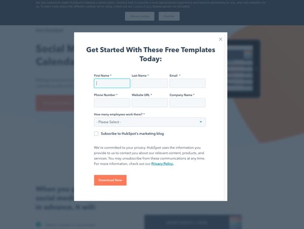
The test featured four different variations of sign-up forms, which is an A/B/C/D/E design. The image below is the control variant.

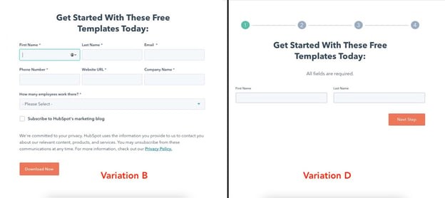
Results were significant as variations B and D outperformed the control variables at 96% and 100% confidence, respectively.
The image below shows variation B on the left and variation D on the right.

This demonstrates that, in the future, conversions on the blog could increase if winning form submission designs were applied to blog posts.
Optimizely’s Landing Page Headline
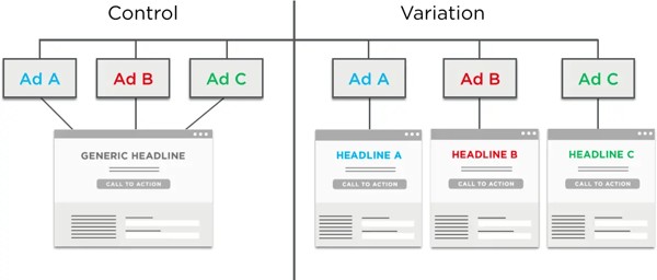
Optimizely was running a few PPC ads with several different types of messaging on one landing page. The landing page did not use the same terminology as the ad – instead, it read "Try it Out for Free.
So Optimizely decided to test the following theory: Aligning the copy on the landing page to the ad will result in more leads (AKA higher conversion).

It worked! While the control had a 12% conversion rate, the variation led to a 39.1% increase in conversions.
HubSpot Blog’s Slide-In CTAs
Most successful blogs include a call-to-action at the end of their blog posts. It's usually full-width – large enough for people to notice the offer and hopefully convert on it.
But are people noticing that CTA, or are they learning to tune them out?
Here at HubSpot, we were curious if our readers were developing static CTA blindness. So, we decided to run a test to see if we could increase our CTA clickthrough and conversion rates.
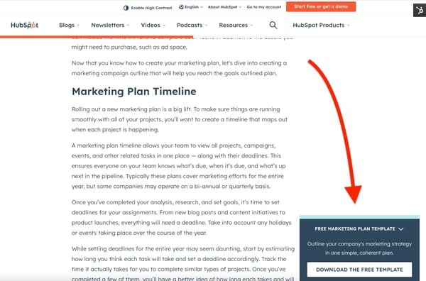
To accomplish this goal, we tested slide-in CTAs that would appear halfway to three-quarters of the way through a blog post.
Here's an example of the slide-in:

To test this out, we added slide-in CTAs to 10 of HubSpot's highest-traffic blog posts. After reaching statistically significant results, we looked at the following stats for the slide-in CTA and the static CTA at the end of the post:
- Clickthrough rate (CTR) - What percentage of visitors clicked each CTA?
- Conversion rate (CVR) - What percentage of those visitors who clicked ultimately converted on the landing page form?
- Submissions - How many total leads did each CTA ultimately generate?
In this test, the slide-in CTA had a 192% higher CTR and generated 27% more submissions – mission accomplished.
Sidekick’s Landing Page Design
This test was done many moons ago when HubSpot Sales was still Sidekick but the value’s still there.
Back then, Sidekick was a chrome extension and the original landing page included a list of all the features from the software:
- See Who Opens & Clicks on Your Emails
- Schedule Emails to be Sent Later
- Access Valuable Information About Your Contacts
But the team was curious to know if those details actually mattered. For a product as low-touch as a Chrome extension, do consumers need a laundry list of features to convert?
To answer this question, the experiment involved replacing the feature list with user testimonials.

The testimonial beat out the feature list by 28%.
Their theory on why this change took place? The former didn't make people curious enough to click through to the Chrome Extension installation page.
Another theory is that consumers wanted more social proof before downloading a new tool into their browser.
There you have it - a rundown of all things CRO testing. If you want more details on how to run a test of your own, check out our A/B test kit below.

