The steady growth of online retail has opened up tremendous opportunity for entrepreneurs to carve their own paths by reaching a worldwide customer base. Selling your products online can be greatly rewarding or terribly frustrating (or sometimes both). One of the critical elements of driving sales is the images used to present the products. In my course at Learn from Fiverr, Product Photography Retouching in Photoshop I explore techniques for making product shots as appealing as possible.
4 Must-Follow Product Photography Tips
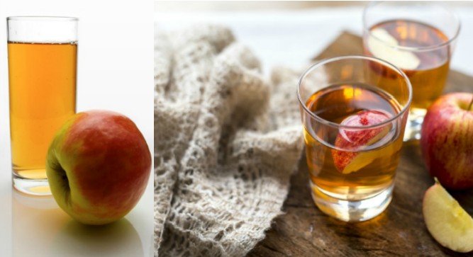
Let’s take a look at two very different shots for a single product and discuss why one is more successful than the other. The product is Apple Juice, and neither shot is showing the actual product package. These would be lifestyle-type images that shows the product in a more “real-world” type of situation. The idea of a lifestyle image is to show the product in a way that is appealing and inviting in an environment that you would expect the product to be used in. Ideally, the image should be inviting the viewer to want to be in the scene being pictured. They want to be there. They want to participate in that moment. Therefore, they buy the product so they can have a similar moment of their own.
Look at these two images side by side.

Both shots show the product, apple juice, in a glass with the actual fruit nearby as a visual reference to communicate what the juice is. But one image is clearly stronger than the other. Why is that? You might easily be able to say that one is more attractive, but can you point to specific reasons why? Let’s take a look at some of the mechanics of image creation that is giving one photo an advantage over the other.
- Camera Angle
- Lighting and shadows
- Set Design and Props
- Depth of Field
In the first image, the one on the left, the camera is level with the glass, the top rim of the glass is seen as a straight line, in fact the entire glass appears almost as a rectangle. Not only is this somewhat confusing at first, it’s also visually uninteresting. While the image on the right is showing the glass at an angle, which shows the rounded opening. Not only is the curve of the glass more interesting to the eye, but the angle is more familiar to us, so it’s comfortable and inviting.
To a large extent, good photography is all about lighting. And evaluating the lighting in these shots reveals some important aspects of that truth. The image on the left has the primary light source coming from behind the product. You can see that by where the shadows are falling on the surface, plus the dark shadow area on the front of the apple. This is an odd choice for lighting a scene and makes the image appear subconsciously uninviting. While the lighting on the image to the right is exquisite. It appears to be natural lighting coming softly from directly above. Notice how the highlights of the glass and juice gleam brightly. And the coloring of the juice is warm and inviting, there’s almost a texture to it that makes you want to taste it! It’s brilliant.
The choices made here have the most impact on these images. Both have apples. But the image on the left has an apple that look somewhat unattractive… it has flat spots that make the fruit look like it might be bruised or soft, and the angle it’s resting at feels random. The choice of the classic white background isn’t necessarily bad, but for a lifestyle image it isn’t recommended. It does nothing to enhance the image in any way.
The image on the right is masterfully setup. The apple looks picturesque and tasty, the stem is critical to showing an “ideal” apple. The choice to have a second glass helps to fill the background frame without being distracting. The natural wood block and terry cloth are great props that add some warmth and softness to a scene that could have been very cold and rigid. But the real stroke of genius is the slice of apple in the juice. While this is not how most people drink their juice (at least I’ve never met anybody who did) it adds an aesthetic appeal to the image that is quite good! It breaks up the surface of the liquid which introduces more opportunity for those beautiful highlights and provides additional color and texture within the glass. It’s gorgeous!
This technique is almost a cheat code for creating attractive product images. Make sure the product is in tack-sharp focus, then everything else is slightly out of focus. This is best done in-camera by using a wide aperture. But can also be accomplished in Photoshop. The effect focuses the visual attention on the product. In the image on the left, the depth of field is not apparent. The glass is in focus, and so is the apple. That’s technically fine, but certainly not anything eye-catching. While the image on the right is using depth of field in a way that makes it difficult to NOT look at the glass filled with juice. (note, even the cut slice of apple is positioned to lead the eye inwards to the focal point, that’s not by accident!)
While any one of these elements will not make one image better than another, when combined together they make a substantial difference in the overall aesthetic. Keep this in mind the next time you are crafting an image for a product shot. Your image can be OK or it can be WOW!
Want to learn more about what makes a product shot successful? Try my course Product Photography Retouching in Photoshop. Only at Learn from Fiverr.
The post Product Photography – Tips from a Certified Adobe Instructor appeared first on .

