Even though loud colors and bold designs can pack a lot of immediate visual punch, they can actually push people away. When it comes to websites, it’s often easier to focus on the simple and understated than it is to pay attention to the brash and busy.
I wanted to learn more about web design that focuses on sleek sophistication and simplicity, so I talked with web designer Evelina Rosinska. She’s built a growing business designing for lifestyle, hospitality, and luxury brands by focusing on subtlety and classic elegance. Evelina shared with me how this kind of design can make everyone pause and take notice.
The Principles of Minimalist Web Design
Nico: First of all, thank you for participating in this interview. For those who don’t know you, can you give us a little background about yourself and what you offer on Fiverr?
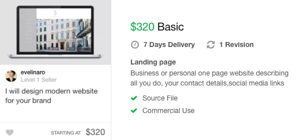
Evelina: Thank you for inviting me. I have been working as a graphic designer for six years, collaborating with London-based agencies and freelancing for clients from around the world. I am a so-called “integrated designer” – this term refers to those designers who first of all think about the brand as a whole and can work with any assets to convey its message, rather than specializing in one particular discipline. I have always been fascinated by developing a brand and expressing the identity of the company, regardless of whether that is by creating logotype, printed publications or a website. Thinking about the brand and its values is always at the core of my work. I want to help companies become more attractive, visible, and communicate better with their customers. Here on Fiverr, my main gigs are creating brand identity and website design, but I am always happy to talk with clients about what else they may need.
Nico: We all know the importance of having a modern and responsive website nowadays. What are the latest web design trends and what do you believe are the key elements of an excellent website design?
Evelina: In the industries I specialize in – which are lifestyle, luxury, fashion, property, and hospitality – the tendency is to go for minimalistic elegance. Less is more, and it’s very important to focus on exposing the product or the offer in the most visual and appealing way: showing big, full-screen images, beautiful typography, and editorial layouts that look more like high-end fashion magazines. I believe in the beauty of simplicity and the well-crafted detail that makes it stand out.
A great website should be easy to navigate, allow the customer to find all the information with no effort, and deliver everything in a digestible and reader-friendly form. It should be visually attractive with beautiful layouts and stunning imagery.
Nico: Regarding ecommerce websites, which CMS do you prefer above all and why?
Evelina: I personally prefer WooCommerce and WordPress CMS. You can find all the plugins and themes that may be needed and it is fully customizable for clients’ needs. It’s also good for a smaller business that is just starting up, as there is no monthly fee for running it.
Nico: Speaking of WordPress, any disadvantages to point out? Is it good enough for professional websites?
Evelina: I am a big fan of WordPress and have designed and developed many successful websites on it. It’s a very customer-friendly platform and there are plenty of plugins and themes that can be adjusted to any brand. There’s no need to build everything from scratch. Also, I am a designer with knowledge of CSS and HTML, so even though I’m not a professional developer, I can still build websites on WordPress and have full control over the look and feel of it, which is important for lifestyle brands. It is also cost-effective for smaller companies to have me do both design and development on WordPress rather than hiring a designer and developer separately.
Nico: In your opinion, what are the best or most innovative web designs you’ve recently seen? Can you explain what you particularly liked?
Evelina: There are for sure websites that have more innovative technological aspects or interesting effects, but, as I said, I don’t think that’s the most important thing for a successful business. I would rather have a clean, easy-to-use website with a fresh and minimalistic look that shows the product to the potential customer well. And I would also rather focus on beautiful layouts and typography than confuse the visitor with all the newest trends and effects. For those reasons, some websites that have caught my attention recently are from Sezane, Cos, The Diligence Company, Sojournal, and Dutch Courage Creative
Conclusion
“Less is more” is the perfect answer to in-your-face advertising and attention-seeking social media. When the world is noisy, it drives people to seek experiences that offer simple beauty and peace. Evelina’s quiet, friendly web designs make people feel like they want to stay for longer. I’m impressed by the way she combined the feeling of Zen with a strategy to encourage people to linger on a site and explore further.
Do you prefer buying from sites with bright, bold designs, or those with a minimalistic approach? Has a web designer ever helped you see the value in a “less is more” approach? Tell us about it in the comments below!
The post “Less is More” Minimalist Web Design Discussed [Interview] appeared first on .


