
With all the attention online marketing gets, brick-and-mortar businesses can easily lose sight of one of the best customer-winning tools they have: their sign out front.
Your business sign sends a clear message to every passerby. But what if that message isn’t the right one?
Graphic designers use key techniques to get a visceral reaction from customers. By mastering these, you can create a unique sign that will not only attract customers like crazy, but also boost brand awareness. Here’s how.
4 Design Tips For Creating Signs That Attract Customers
- Start with a logo.
- Keep it consistent.
- Use the right colors.
- Personalize your brand.
Logo design is far from a guessing game. A good graphic designer will expertly combine subtle elements that send psychological messages to potential customers. NBC’s logo, for example, emulates the colors and shapes of a peacock to help customers subconsciously associate the brand with positive feelings. Even choosing a retro design can evoke a feeling of nostalgia while also sending the message that a business holds itself to classic ideals. If you invest in a winning design, you can use it for all your promotional materials, including your store signage.
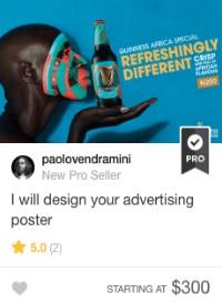
The design has to adapt to the public, not the other way around [Paolo Vendramini – Graphic Design Success Strategy Explained]
Keep in mind that simplicity gets better results – especially when you’re trying to make a quick first impression on someone passing by. A closed circle in a logo helps convey a warm, cozy feeling associated with home, a sense of community, and friendship. (You can think of it as the design version of a hug.)
Vertical lines subliminally express masculinity and strength. But in a horizontal formation, those same lines can have more of a calming effect, especially when they emulate a horizon or beautiful sunset.


Your font choice can play also a big role in sending your intended message. Calibri is clean and crisp and Baskerville Old Face can send a message of reliability. Curved or script typefaces imply elegance and creativity, while bold or modern lettering can imply strength or progressiveness. Companies like Braun use a customized font to convey an image of being both minimalist and elegant. Your logo should match your brand’s message, whether you’re trying to say “friendly community business” or “large, fast-paced financial firm.”
Like your other marketing materials, your sign should match your brand’s overall theme, communicating instantly what you sell and who you target with your products.
If you’re a lighthearted, fun company, the colors and design elements you choose for your sign should be bright and playful – cupcake shops like Sprinkles often employ this technique.
A more serious business needs a sign that uses simpler, toned-down colors and design. This law firm takes a classy approach to its signage, giving off a trustworthy vibe to potential clients. On the flipside, a firm with a flashy sign reading “1-800-Divorce” might immediately give the impression of being eager to make as much money as possible at whatever cost.
Know your market before beginning your sign design to ensure you’re connecting with your target audience. Play with various designs until you find the perfect one to match your desired brand personality.
Color is an essential part of your store signage. Be mindful of the emotions that the colors you choose evoke, as well as the message they convey when combined with other colors. Complimentary colors can create a contrast that catches attention, while similar colors can evoke a sense of harmony. Warm tones like oranges and yellows can come across as more aggressive, whereas cool tones like purples and greens are seen as less intrusive and more passive.
Hannah Curran – Fiverr Social Media & Content Manager
For a complete, dynamic look, get an entire palette of colors in your designs from a Fiverr doer like Jackietrades [Color Design – The Primary Marketing Tool]
You should also be aware of how colors affect customer behaviors. Experts say that people tend to eat more when surrounded by warm colors like reds and yellows, while cool colors can cause appetite suppression. Ignoring this psychology could be a grave mistake for a food-related retailer or grocery store.
Text isn’t the only way to communicate – sometimes a picture can convey a message better than words. Often businesses will use people or animals in a logo to position themselves as a family-friendly company that cares about customers.
You should also consider this if your sign allows you to add special announcements. Instead of letting passersby know about a sale you’re having, consider using it to congratulate customers who have just gotten married or to thank the local community for its support. These personal touches will help endear customers to you and ensure repeat business.
A business’s sign often serves as the only marketing message a customer ever sees. Over time, people may even come to know your logo and colors at first sight, and associate your sign with the quality service you offer.
Do you have any interesting experiences in creating a logo or sign? Let us know in the comments below!
The post Is Your Sign Scaring Customers Away? Design Tips to Win Customers appeared first on .