In July 2023, Mark Zuckerberg launched Meta’s much-anticipated X competitor: Threads. Meta’s vision for this new social platform was to offer “a new, separate space for real-time updates and public conversations” that was built on the foundation of Instagram’s existing community, content, and infrastructure.
As explained in Meta’s official announcement, “Threads is to take what Instagram does best and expand that to text, creating a positive and creative space to express your ideas." Like Instagram, you can follow friends and creators who share your interests.
Of course, Threads has received its fair share of criticism, from accessibility concerns to accusations of using “dark design” tactics. Nevertheless, Threads hit more than 30 million sign-ups in its first 16 hours alone. It’s continued to gain traction since then, demonstrating the strength of the app’s design.
In this article, we’ll cover the design choices that have helped Threads go (and stay) viral, the areas in which it has fallen short, and what it might take to address these shortcomings.
Table of Contents
- What is Threads?
- Why was Threads created?
- How Thread Leverages Great Design
- Where Threads Falls Short
What is Threads?
To understand the design choices that underpin Threads, it’s important first to clarify what Threads is — and what it isn’t.
At its core, Threads is a standalone app that lets users share short, text-based content of up to 500 characters per post. It also offers many features with which Twitter (now known as “X”) users will likely be familiar, such as liking, quoting, or sharing posts.
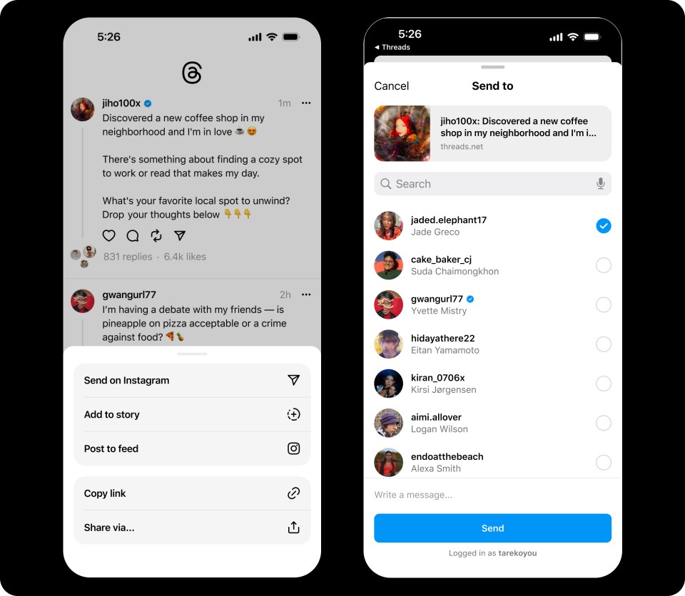
Threads is also closely tied to Instagram. While there are options to create custom profiles, by default, Threads simply ports over data from users’ existing Instagram accounts. It also offers seamless integration with Instagram, with capabilities such as sharing Threads posts to your Instagram story or in an Instagram DM.
You can also automatically follow the same accounts on Threads as you already do on Instagram.
However, integration with other platforms remains limited: While Zuckerberg has promised compatibility with an open social networking protocol, it’s not currently possible to engage fully with Threads content without first creating an account.
In addition, Threads is not yet available in the European Union due to “regulatory uncertainty” regarding Meta’s adherence to the EU’s strict privacy and security regulations.
But in spite of these shortcomings, Threads has truly taken the world by storm.
According to Meta, the platform reached more than 100 million sign-ups in its first week, and it has remained consistently popular since then. As such, marketing leaders looking to stay up-to-date on the latest social media trends would be wise to pay attention to this important new platform.
Why was Threads created?
The timing of Threads’ launch was likely quite intentional: Zuckerberg’s announcement regarding this new app came on the heels of mounting dissatisfaction with Elon Musk’s leadership of Twitter.
Observers have suggested that this competitive landscape was likely a significant factor that drove the early success of Threads.
That said, Threads is more than simply a Twitter copycat. While many of the core features of Threads clearly draw inspiration from Twitter (the scrolling user interface, the content feeds, etc.), Zuckerberg’s vision for this new platform is also uniquely integrated with the larger Meta ecosystem.
In addition, Meta has released substantial improvements and additions in the months since Threads’ initial launch. The company promises to continue rolling out new features and capabilities in response to user feedback.
At a high level, Zuckerberg has described his vision for Threads as “an open and friendly public space for conversation.”
The extent to which he is able to realize this vision long-term remains to be seen — but there’s no doubt that the Meta team has already built a successful platform that leverages great design principles to create a strong, engaging user experience.
How Thread Leverages Great Design
There are several elements of the Threads user experience that showcase great design. Below, we explore several of our favorite components of this new platform:
Easy Onboarding
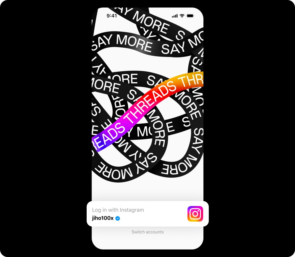
First, Meta developed an onboarding process that makes joining the Threads platform smooth and easy. Instead of having to make and verify a brand new account, you can simply log in with your existing Instagram credentials.

Then, once you log in, your account is already populated with data from your Instagram profile. From your profile picture to your bio to your existing network, you don’t have to start from scratch. With just a few clicks, your Threads profile is fully set up, and you can get started posting and sharing right away.
What we love: Threads offers a smooth, easy onboarding experience, with key information automatically ported over from your Instagram account.
Integration with Instagram
Threads’ integration with Instagram doesn’t stop with the onboarding process. Design best practices tell us that a smooth, well-integrated user experience is critical to ensure people stay engaged throughout their time on the platform.
That may be why Meta has prioritized offering integrations with key Instagram functionalities such as DMs, followers, and posts.
When Threads was first launched, reviewers criticized its lack of direct messaging support — but just a few months later, Meta released an update that enabled Threads users to share posts directly with their friends using Instagram’s existing DM platform.
With this new integration, you can easily share a thread with a single contact or a group of friends in your Instagram DMs.

In addition to this DM integration, Threads also enables you to share Threads in an Instagram post or story, offering users even more functionality while driving awareness of the new Threads platform across Instagram.
What we love: Integration with existing Instagram features makes Threads that much more accessible and easy to use.
Finally, the integration of accounts across Threads and Instagram makes it possible to easily port over followers from one platform to the other.
This means that instead of having to reconnect with everyone you know from scratch, you can easily replicate your existing social media network when you get started on Threads.
Feed Customization Options
Another important design element is Threads’ options to customize your feed. Specifically, Threads enables you to tab between a “For You” feed that includes a mix of recommended content and posts from people you follow.
There's also a “Following” feed, which only includes posts from profiles you follow.
What we love: Threads is designed to let you toggle between a “For You” feed and a “Following” feed, enabling you to customize the content you see.
This kind of customization is important. As with any platform, different users on Threads will have different preferences.
Some may be looking for content that is relevant to their interests but is from creators outside their immediate network, whereas others may only be interested in viewing posts from accounts that they have actively chosen to follow.
With this tab-based user experience, it’s easy to alternate between these two modes and experience the platform in the way that works best for you.
Translation
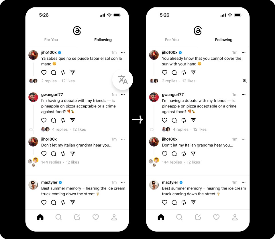
In addition to fairly standard accessibility features such as screen reader support and AI-generated image descriptions, Threads also offers translation support to enable users to engage with content in multiple languages.
Importantly, this feature has been designed to be functional while remaining as unobtrusive as possible. Threads posts can be automatically translated from the language in which they’re written into the language that the viewer has set their account to.
In addition, if you see a thread in a different language (and your language is available to be translated into), you can just click the translation icon at the bottom right of the post to quickly and easily view the content in your selected language.

What We Love: This translation feature helps overcome language barriers and makes Threads posts accessible to users around the world — which is particularly important given that the Threads app is now accessible in more than 100 global markets.
Block Words or Profiles
Finally, one of the most critical features to keep any social media platform safe and useful is the ability to block content that you don’t want to see.
On Threads, there are a few key ways that you can filter out irrelevant or undesired content from your feeds.
First, you can specify words and phrases that you want to keep hidden. This means that any replies to your threads that contain these specific worlds will be filtered out.
What We Love: While automated or rules-based content guidelines are a vital baseline for safety and useability, empowering users to make their own decisions about the kinds of posts they do and don’t want to see is a hallmark of great design.
In addition, you can unfollow, block, restrict, or even report a profile.
For content that you’re just not interested in seeing, unfollowing or blocking may make the most sense, whereas for content that might be in violation of Meta’s Community Guidelines, reporting the offending profile can help ensure that other users are also kept safe.
Moreover, any accounts that you’ve blocked on Instagram will automatically be blocked on Threads, too. You don’t have to worry about seeing content from accounts that you’ve already decided you’re not interested in.
Where Threads Falls Short
Despite these substantial strengths, Threads also falls short in several key ways.
Below, we explore several of these flawed design choices, as well as strategies that could help address these shortcomings and improve going forward.
Accessibility
First and foremost, while Meta has touted its commitment to ensuring accessibility across its social media platforms, critics have commented that several of Threads’ design choices leave something to be desired from an accessibility standpoint.
In fact, accessibility expert Paul Speller conducted an audit of Threads shortly after its launch, and he identified multiple shortcomings related to nearly half of the accessibility criteria he considered in his review.
For example, Speller’s analysis found that Meta’s automated image description generator struggled to accurately capture the intention behind many images, meaning that image content remained inaccessible to users who depend on a screen reader.
The blue tick marks that indicate verified accounts are also not represented with any kind of alt-text, further limiting accessibility for visually impaired users.
Beyond issues related to ensuring compatibility with screen readers, the Threads design has also been criticized for failing to adhere to other best practices, such as the use of high-contrast colors and the availability of transcriptions for audio content.
In light of these challenges, Threads may benefit from conducting a comprehensive audit and ensuring that their user experience takes factors such as screen reader compatibility, audio descriptions and transcriptions, and other accessibility best practices into account.
Excessive Notifications
When designing any sort of digital platform, it’s always tricky to strike the right balance between providing useful, engaging notifications and avoiding annoying the user with endless, unhelpful pings.
Unfortunately, some commenters have argued that Threads has fallen prey to this common challenge, with too many unnecessary notifications enabled by default.
In particular, while other profile settings are copied over from Instagram automatically, Threads has been criticized for forcing users to manually reset notification settings from scratch. That means you may find yourself getting a lot of alerts that you’ve already told Instagram you’re not interested in seeing.
Moreover, by default, Threads sends you a notification every time someone in your network joins Threads.
While this may be useful in some cases, it’s a design choice that at least one observer dubbed a “classic dark pattern,” as it interrupts users and intentionally pushes them to check the app more often than they otherwise would.
To be sure, notifications are an important feature of most social media platforms. But when it comes to optimizing an app design for useability and a positive user experience, it’s vital to avoid overdoing it and drowning the user in excessive, unhelpful alerts.
Data Security
According to Calli Schroeder, senior counsel and global privacy counsel for the Electronic Privacy Information Center, Threads gathers “a good amount [of data that] is not necessary for the app to function.”
What exactly is Schroeder referring to? Threads can collect user data such as sexual orientation, race and ethnicity, biometrics, union membership, pregnancy status, employment, religious beliefs, and more. It can also collect data related to users’ health and fitness, location, and web activity.
And, as Schroeder explains, “Health and financial data, precise location, search history, browsing history, and more are not needed for a user to be on the app and are instead used to create a more hyper-personalized and targeted experience on the app or shared with and sold to advertisers.”
These data security concerns are a major part of why Threads isn’t available in the European Union, where regulations bar the collection of this sort of data for advertising purposes.
But beyond limitations in specific markets, the collection of so much personal data is a real cause for concern for users from anywhere around the world.
To ensure a user experience that’s not just legal but also truly safe and secure, it’s important for tech companies like Meta to make conscious design choices that limit unnecessary or unsafe data collection practices.
Visibility into Trending Topics
One of the most well-known features of Threads competitor X is the hashtag: a clickable keyword that enables users to see similar content.
To date, Threads has yet to replicate this key functionality. While you can include a hashtag in the text of a post on Threads, there’s no way to create a functional, clickable hashtag, and there’s also no way to view currently trending hashtags.
This shortcoming has been widely criticized, and yet there’s still no word that Meta intends to add any sort of hashtag functionality to Threads. As a result, there’s no clear way to view Threads posts by topic or gain insight into the topics or keywords that are most popular in real time.
Account Deletion
Finally, one of the most concerning design flaws in Threads is the lack of ability to delete your account without also deleting your Instagram account.
While Meta appears to be aware of the issue, there’s no indication of any forthcoming solution anytime soon.
As a Meta spokesperson recently explained, “To clarify, you can deactivate your Threads account, which hides your Threads profile and content, you can set your profile to private, and you can delete individual Threads posts — all without deleting your Instagram account.”
According to Meta, Threads is powered by Instagram, so right now, it‘s just one account. “We’re looking into a way to delete your Threads account separately,” the spokesperson said.
This means that once you create a Threads account, there’s no way to fully delete the account (and all the data Threads has collected from you) unless you’re also willing to delete your linked Instagram account.
The Future of Threads
The impressive early success of Meta’s Threads speaks to the strong design choices made by the Twitter competitor. From its easy onboarding experience to extensive integrations, customization, and other important features, Threads illustrates the importance of great design to ensure users stay engaged.
That said, Threads isn’t without its fair share of flaws and shortcomings. Critics have pointed to accessibility issues, data security concerns, and other critical limitations, all of which hamper the user experience and may reduce the app’s long-term success.
Ultimately, only time will tell whether Threads becomes yet another flash-in-the-pan social media experiment or manages to truly stay viral.


