When people are looking to buy or rent a new house, what's the first thing they do? That's right, they go online.
In fact, 51% of home searches start on the internet. People search Zillow, Apartments.com, Redfin, and local real estate websites.
Additionally, people also turn to the internet when they want to value their home or learn more about the real estate market.
All this to say that when it's time to generate leads in the real estate industry, posting online and creating a landing page is the first step.
In this post, we'll discuss how to create a landing page for real estate and review sample real estate landing pages to inspire your own.
1. Choose the type of landing page you need.
Before you can get started, it's important to understand the different types of real estate landing pages.
The three main types include:
- Home valuation: This type of landing page lets users type in their address and get a quick idea of how much their home is worth.
- Buying/selling websites: These websites are where buyers and sellers go to place listings online, including Zillow or Redfin.
- Free content: This landing page is usually targeted toward those who want to start working in the real estate industry or are in the beginning stages of buying/selling. You can place free content on a landing page to get leads to download the offer so when the time comes to buy or sell, they think of you.
Depending on the type of landing page you need, the process and design will be a little different.
2. Use a simple lead capture form and search function.
When creating a landing page for real estate, the goal is to gain leads through a lead capture form asking for information (whether it be a name, email, or phone number). The first step to doing this is to have simple search functionality that is front and center in your design for home buying/selling or home valuation.
If you're creating a landing page for free content, you won't need a search function, but you will need a lead capture form that is simple and easy to use (this should also be a large part of your design that is easy to see).
The simplicity of the search function or lead capture form will make your call to action (CTA) stand out and get people searching through your site.
With Zillow, the home page has a simple search function so homebuyers can search for houses in a certain area. This keeps the site clean and it gets straight to the point -- no distractions.

3. Always pay attention to curb appeal.
Everyone knows that curb appeal is important when it comes to buying or selling a home. The same holds true for your landing page. Use clear, crisp imagery that inspires home buyers to imagine their new life in the house you're selling. When this happens, buyers are more likely to convert.
The visual design of your landing page is even more important than most landing pages. If people don't like the design of the landing page, they might not even like the house because they can't see past the poor web design.
4. Write honest copy.
The copy you write for each house should be honest. You'll want to include detailed information and use descriptive adjectives that will paint a picture for prospective buyers. But don't embellish.
When people start visiting your house they'll see what's true and what isn't. If you aren't being honest in your copy, then people won't want to work with you because they can't trust you. You should use short copy that's punchy and to the point.
Buying or selling a home is a major financial and life decision. Trust is of the utmost importance between you and your prospective leads.
5. Include testimonials.
Although most home buying efforts begin online, most people hire real estate agents through referrals. In fact, 42% of sellers who use real estate agents find these agents through referrals and 82% of all real estate transactions come from referrals. This means that customer testimonials and reviews are very important. On your landing page, include testimonials so visitors know they can trust you.
It's a particularly good idea to place testimonials near your CTA, so it motivates people to click on your form.
You can also place badges or awards on your landing pages to instill a sense of professionalism and credibility.
6. Highlight the benefits of your offer.
Depending on the type of landing page, you might need to highlight the benefit of your content offer. For example, if you have a home valuation calculator, it's important to write copy that emphasizes why this will give a seller more power in the process. Or if you're giving away a free checklist or ebook, explain how it helps people in the process of buying or selling.
This is how you'll communicate your value with your leads, which will inspire them to convert.
7. Be personal.
The intent of your landing page is important. Your landing page will look different if it's a home valuation, buying/selling, or content offer page. The point of creating a landing page is to create a personal experience for those interested in certain offers.
That's why landing pages are different from your everyday website. These pages keep customers focused on going down the path they want: searching for a home, getting in contact with an agent, etc.
Additionally, the design of your landing page should be personalized to the experience of the viewer. This means that your page should be optimized for mobile, tablet, and desktop experiences. You might also have an app that will help your visitors come back anytime they're looking for a home.
Best Real Estate Landing Pages
1. Redfin Home Valuation Landing Page
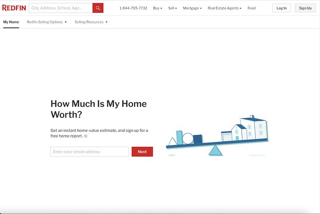
Talk about a simple landing page. This is a no-fuss home valuation landing page that lets visitors get a real-time estimate of how much their home is worth.
This landing page is a good example of being simple, using short, punchy text and engaging graphics to draw attention to the simple CTA of entering a home address.

2. Hill Realty Group
This is a great example of a realty group's home search landing page. First, it focuses on the curb appeal of the properties and areas that it sells houses in. Then, it includes a simple property search where you can include your location, bed and bath requirements, etc.

3. The H. Williams Group
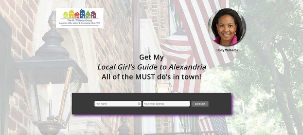
This is a sample real estate landing page with a content offer. This realtor has a simple lead capture form enticing visitors to download her guide to Alexandria. This is a great content offer because people looking for a guide to the area are most likely going to move there and may contact her to be their realtor.
Additionally, this page is great because all the focus is on the simple capture form. The design is sleek and simple, with a logo, picture, headline, and capture form. That's it. That's why this landing page works.

Creating a real estate landing page is very important for marketing your listings or offers. That's why it's important to create a landing page that will convert visitors into buyers.

