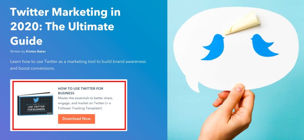
The other day, I was reading a blog post about using Twitter for marketing. While reading through the post, I noticed an offer for a free ebook about the same thing, and by clicking on it, I was taken to a new page.
This page let me know what was in the ebook, how to download it, and the benefits of this content. I also noticed a few things that separated this particular webpage from others.

First, I noticed that this landing page was simple. It wasn't terribly busy, and the design seemed to directly support the ebook. Second, I noticed that all of the copy was nicely organized and made the ebook sound like a must-have. And finally, I learned that I could obtain this ebook just by entering my name and email address.
To me, this was a pretty sweet trade. I could access even more information about using Twitter for marketing — for free. I thought devoting an entire page to this offer was a pretty smart idea; That way, it could focus solely on communicating the usefulness of a guide.
This is the glory of using a landing page, which we'll get into in this post. We'll also go over how to create a landing page of your own, step by step. To start, let's talk about what a landing page is and how it can be a useful asset for your business.
Landing pages are great for acquisition and can easily fit into your content strategy. If customers see a CTA on one of your webpages, ads, or email, clicking on it should land them on a page that has an offer or service.

Generally, landing pages come in two different forms: reference and transactional. Reference landing pages provide valuable information or a summary of your business. They are like a snapshot of your business, whereas transactional landing pages usually require the visitor to make a purchase or complete a form.
The types of valuable information you could provide to viewers covers a wide range. Some examples of content include a mailing list offer, an online purchase, a free guide for download, or a coupon for first-time buyers.
Landing pages are a useful function of marketing and sales strategies, and they give your sales team possible leads.
For example, if your company is in the technology industry, you can use a landing page to net email newsletter signups for your weekly roundup of tech news. Your sales team can be assured that the viewer who completed that form is a lead that's already displayed their interest in your company's offerings.
Landing pages are separate from other pages on your website — such as an about page or a product page — because the specific purpose is acquisition. Through expressive, engaging content, landing pages convey the message that completing a form or supporting your business will provide the visitor with desired benefits.
So when you're designing your landing page, think about what will make that visitor want to provide their name and email address.
As a consumer, what really makes me want to interact with a landing page is an offer that seems too good to pass up and a form that makes obtaining that offer easy.
Landing page designs don't have a lot of bells and whistles that are going to distract the visitor. This makes for a quick and easy browsing experience.
To make sure your landing page is effective, consider making the graphic content less of a priority unless it supports the benefits of your offer. Create copy that engages the reader and is succinct. To help with the design that's successful, choose a landing page template.
Now that you're clear on a couple of best practices, let's talk about how to create a landing page using a template.
How to Create a Landing Page
We've talked about how effective landing pages are simple and great for acquisition. Now it's time for the fun part: creating your own.
I'll take you through the motions of creating a unique, clean landing page. I used HubSpot's CMS, but you can use any similar software that offers landing page templates, like Mailchimp.
I love using templates because they take the coding complications out of designing, and I can focus on maximizing the design to be successful.
Let's get started!
For this example, let's say that I'm a marketer for a fictional NASA-esque space corporation, and I've been tasked with making a landing page for a fantasy ebook about space to get children interested in aeronautics. This landing page's goal is to increase leads.
1. Choose a template that will help you achieve your goal.
To build my page, I chose from a list of templates, while keeping my end goal in mind.
Knowing that increasing leads and the customer experience were top priorities, I chose a template that showcased my ebook offer and provided a form. I also wanted a unique, eye-catching structure and a simple design.

What I like about this landing page template — in addition to the criteria above — is that it’s labeled as "Starter." As a marketer with little to no design experience, a beginner-level working template sounded right up my alley.
2. Name your landing page so you can find it later.
Next, it's a good idea to name your landing page. If you plan on having multiple pages exist on the same system, be sure to name each something that will distinguish one design from future pages. For this example, I decided to name it "Ebook Offer One."

That way, when I check on the performance of this particular landing page, I'll locate it easily on my dashboard.
3. Design your page layout according to what you want your audience to see first.
After labeling your landing page, let's start designing. For this step, I was able to use a drag and drop editor. I'd decided that it was important for the leads to see the eBook's cover, an engaging description, and the form.

As a visual learner, a drag-and-drop editor is a dream come true. I can spend less time trying to learn code that would fix these elements and more time visualizing the experience for the lead. I can look at how the header's copy will be presented and if it's effective at keeping audiences engaged.
4. Communicate the benefits of completing the landing page to the website visitor.
Somewhere on my landing page, I wanted to provide short, impactful blurbs of value that would ultimately persuade the reader to complete the process.

The three columns at the bottom of the form communicate the value of my ebook. These columns each had their own engaging icon that was colorful, professional, and clean. I used the text to communicate a main benefit, then described it in a sentence below.
5. Personalize the page so it's unique to the purpose and your brand.
The next step is sort of a "Choose your own adventure." Here, I added elements that would fit with the brand of my imaginary company. I uploaded a logo image and made sure the colors were consistent throughout.

I wanted to make sure the text stayed black and white to match my logo and the images didn't disrupt the usability of my webpage. This choice makes the page look professional and functional.
Once you're satisfied with the layout and design, it's time to move on to the final steps.
6. Test your landing page for dynamic content and user experience.
Because mobile phone usage is increasing each year, it's a good idea to test your page to ensure it's dynamic. When your page is “dynamic” it simply means that the content on your webpage automatically adapts according to the type of screen being used to access the content.
Here, I tested my landing page for formatting on mobile. I wanted to make sure that the content was still displaying neatly and professionally, despite being shown on a different screen type than the one I used to create the page.

If you're using a CMS to make your landing page, check if the software offers dynamic content options. For example, if you find that the logo you're using doesn't appear as beautifully on a smaller screen, you can make the necessary adjustments.
7. If you desire, run a test to analyze page performance before making it live.
Finally, consider running a test on your page. Testing can show variations of your page to audiences and analyze which variations perform better. In this case, the winning page would have the most conversions.
With the software I'm using, I can choose to run an A/B test or adaptive test. Both of them achieve the same goal, with the only difference being that the first runs two different versions and the latter runs many.

These tests will be running with a real audience, so make sure your pages look publish-ready before you begin. Be sure that the form fields work and your copy is free of any typos.
After completing these steps, your landing page is complete. I bet it looks fabulous. Now, let's talk about how to get your landing page seen.
How To Get Traffic Using Landing Pages
Landing pages are only effective if they receive traffic. You can boost the traffic of your pages in a couple of ways.
For instance, you can build CTAs that link to your page and drop them in related content. If I were to create a CTA for my landing page, for example, I would include a line of text that hyperlinked to my landing page in a related blog post.
For example, check out how this CTA that directs to a landing page fits into this HubSpot post about product marketing:

This CTA relates to the topic, product marketing, and fits in nicely with the post's introduction. It doesn't interrupt the flow of the piece but allows for a chance to get more downloads.
I would also add a similar CTA button to the bottom of my blog post, shown below, or add it to email newsletters. In addition to blog posts and emails, a great way to drive traffic to your landing page is to promote the offer within the page on social media. This increases visibility without spending extra money.

Remember to optimize your landing page for SEO. Most CMS software is really good at pointing out SEO opportunities for web pages. Optimizing your page could get more traffic from queries on search engines.
For example, to optimize my space ebook for SEO, I would make sure the ebook has an engaging, yet relevant title. I would also tag the post with relevant keywords in order to boost visibility on search engine results pages.
How have you recently seen a landing page promoted? I've seen some while scrolling through LinkedIn and in email newsletters. After I dig into this ebook for using Twitter for business, I'm going to try my hand at creating another — after all, you can never have too many opportunities to earn more leads.

