They say the best things often come in small packages. Think about it: jewelry, books, the keys to a new car ... all of these things support this notion. And with our attention spans shrinking below that of a goldfish, it should come as no surprise that we crave more focused content at a smaller scale, too.
Here’s where microsites come into play. Unlike regular websites, microsites tend to be simplistic and easier to navigate. This isn't to say they won't make you want to poke around for a while, though. In fact, the really great ones do just that. In this post, we’ll show you some great design examples of microsites in action.
What is a microsite?
A microsite is a web page or small website made to promote a company’s product, service, campaign, or event. Microsites typically use a different domain or subdomain from the main company website and include links back to the main website, but act as a separate entity for the brand.
Microsites can help brands achieve a number of things. As HubSpot Product Manager Alex Girard puts it, “You can use a website to create a digital experience for a number of different moments in the buyer’s journey. It doesn’t have to be just a corporate ‘.com’ website for converting visitors to leads. You can build digital experiences that span the entire customer journey.”
For example, many companies use them to highlight a specific campaign or target specific buyer personas. Others use them to tell a short story or to experiment with new types of branded content, or to spread to a new region. With a big event coming up, a company might launch a microsite to spread awareness and promote sign-ups.
Whatever the reason, the goal of a microsite is to engage visitors with a specific message, generate interest, and draw them to the business’s offerings.
1. Website Grader (HubSpot)
HubSpot Website Grader is a microsite to improve your website, for free. Paste in your site’s URL and your email address, and Website Grader will leverage Google Lighthouse’s automated assessment system to assign a grade to your website.

Website Grader calculates your grade based on four key factors — performance (how fast your website is), SEO, mobile, and security — each of which receives its own score. For each factor, Website Grader breaks down your site’s rating and suggests areas for improvement.
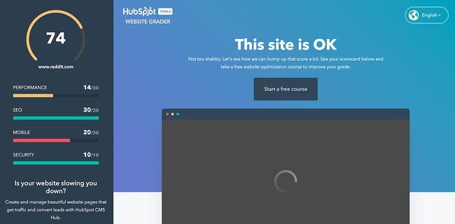
Along with its suggestions, Website Grader directs visitors to a HubSpot Academy course on increasing their website grade. If users need more guidance, they can click one of several CTAs on the assessment page to take the course.
2. Listening Together (Spotify)
Spotify knows how to make a microsite — its hugely popular Spotify Wrapped series began as a microsite and has since become a feature of its mobile app. In 2020, the streaming platform introduced a new microsite to support its Listening Together campaign.

The microsite features a spinning three-dimensional map of the Earth covered with pins. Each pair of pins represents two users pressing play on the same track at the same moment. When you click a pin, you can hear the song being played, making this microsite a means for discovering new music.
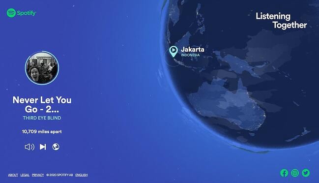
Overall, it’s the kind of microsite that only a brand like Spotify could pull off, a clever and heartwarming reminder of how music brings us together.
3. My Creative Type (Adobe)
Adobe’s software suite contains more than a couple of industry-standard tools for visual creatives. Beyond the well-renowned tools it makes, a big force behind Adobe’s success is the brand’s ability to align itself with customers through marketing. The microsite My Creative Type is a prime example.

On this microsite, visitors complete a short questionnaire to determine their “creative personality.” The 15 questions assess your thinking, behavior, and outlook, each followed by a playful video metaphor for the answer you give.
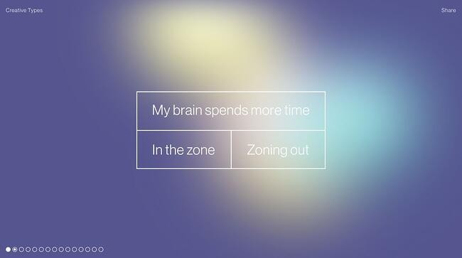
At the end, you’re given one of eight creative types (I got “the Maker”) and a description of your strengths, potential, motivations, and advice for pursuing creative goals. You can then download your type or share it on social media.

Though it’s not made entirely clear how empirically sound all of this is, it’s still a fun way to bring new aspiring artists into the fold.
4. Emojitracker (Emojipedia)
There’s no "point" to emojitracker.com. It was created by Matthew Rothenberg, former Head of Product at Flickr and Bitly, as an experiment to track all emojis used on Twitter in real-time. Now, it’s maintained as a microsite for Emojipedia.
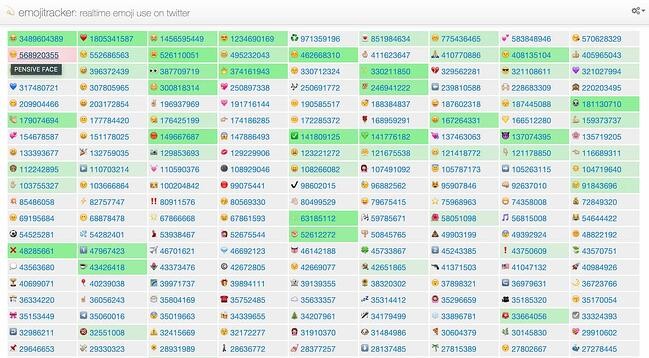
The only calls-to-action on the site are some outgoing links at the very bottom. Otherwise, it's just for pure interest. With no navigation bar or way to get to another site, it might actually confuse some visitors.
Emojipedia might break some rules of user interface design, but it also shows that microsites don't need to have complicated designs and that a cool idea can get you pretty far. Make it simple enough to keep people on the page without taking up too much of their time.
5. Elf Yourself (OfficeMax)
I think it’s a rule that you can’t write about microsites without mentioning Elf Yourself, perhaps the most successful microsite of all time. Come the holiday season, expect your inbox to be rife with animations because Elf Yourself isn't going away.

What made the site so popular in the first place? Well, it’s hilarious. Besides that, the content is easily shareable, the website is simple to use, and it makes the users the stars. You would hardly know this is a corporate-sponsored site.
OfficeMax used the microsite to be creative and let their freak flag fly, and actually pulled it off. The company focused its campaign on the consumers, not the brand — but the sales tie-in came at the end of the Elf Yourself videos in the form of coupons and promos.
6. Blue Heart (Patagonia)
Patagonia is one of the few exceptional brands that not only offers a top-tier customer experience, but goes above and beyond in its advocacy work. In a partnership with Farm League, the company created a microsite to draw attention to environmental harm caused by hydroelectric dams in the Balkan region.
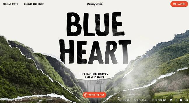
Unlike most other microsites, the Blue Heart website does not include prominent CTAs directing visitors to the main Patagonia website. Instead, it places focus completely on the story being told with various elements: a short film, articles, and an interactive map.

It’s rare for brands to put out microsites of this quality — Blue Heart is an engaging, visually rich experience with a mission that goes far beyond generating leads for the business to serve a greater mission.
7. Inside CHANEL (Chanel)
Inside Chanel is a microsite that harnesses multimedia to educate visitors on the company’s history and heritage. The site houses a ton of short, social videos that chronicle the people, places, items, and events that have contributed to the continued success of this iconic fashion brand.

The purpose? “The strategy behind this microsite is to create some accessibility of Chanel’s history, but more importantly, their success throughout the years,” explains Dalia Strum, president of Dalia Inc.
We love their video-centric approach to visual storytelling. Each video pulls back the curtain and gives you an exclusive look at behind-the-scenes photos and stories as they pertain to different aspects of the brand — color, couture, and so on.

This site isn't Chanel's first stab at microsite creation. In fact, the brand has experimented with multiple microsite formats, including the editorial-style site Chanel News.
8. Xbox Museum (Microsoft)
To celebrate the 20th anniversary of its Xbox brand, Microsoft launched the microsite Xbox Museum, a virtual tour of its various consoles throughout the years.
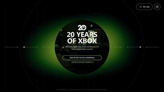
This content-rich site is built around the significant events in Xbox’s history, including console launches, design plans, game releases, and more. You play as a character who navigates a virtual timeline, visiting articles marking each event.
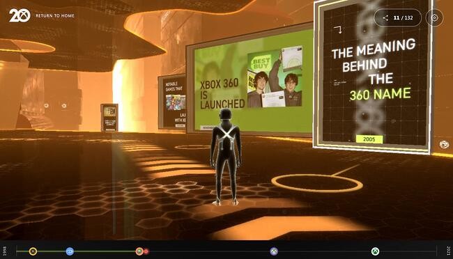
It’s a unique and fitting way to celebrate such a huge milestone for the business, plus a way to capture the nostalgia of long-time fans and the interest of new ones.
9. Life at Home (Ikea)
2020 and 2021 marked a major shift in where and how we spend our time. To shed light on the intersection of mental health and living space, Ikea published a microsite of original research and ways to be happier at home.

Throughout the report, readers learn how our mental health, families, and communities have changed throughout the COVID-19 pandemic. They emphasize the role of a comfortable living space and strong relationships in our mental well-being. Other cool elements include a map visualization, videos, and short questions posed to the reader.
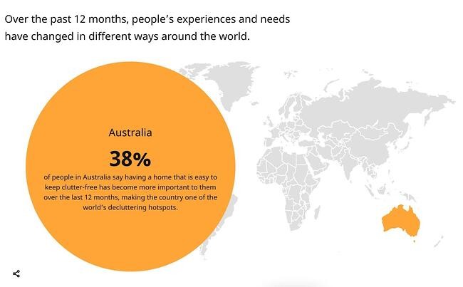
Ikea’s microsite expertly connects the importance of safe living spaces and healthy relationships back to its branding, forming positive associations in the minds of visitors and bringing them closer to a purchase.
10. NASA Spacecraft (NASA)
Let’s be honest, spaceships are probably the coolest thing ever, and NASA knows this. That’s why they launched (pun intended) this microsite: to catalog all of its satellites, from its first in 1960 all the way until its most recent launch, the James Webb Space Telescope.
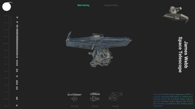
Each spacecraft has its own three-dimensional visualization that you can rotate and view from various angles, along with a brief description. It’s enough to reignite any kid’s (or adult’s) interest in space research and exploration.
11. Chipotle Farmers Market (Chipotle)
Fast casual dining favorite Chipotle wants you to know that its ingredients are sourced sustainably and ethically from family farms, so it launched a microsite dedicated to supporting them.

The Chipotle Farmers Market is a microsite that lists some of the company’s suppliers and links to their websites where you can purchase their products directly. The site is also a means to advertise the Seed Grants program, which gives $5,000 to 50 farmers under 40.

Microsite vs. Website
While microsites are often their own websites, there are a few things that differentiate them from what we usually call websites.
The main difference between a website and a microsite is its purpose. An organization’s website often does many things, including explaining its products or services, sharing its values and mission, and selling products. It’s the main place where visitors, leads, and customers go to learn or do business with you. It’s also probably built in order to drive conversions and encourage visitors to a purchase.
Microsites, on the other hand, could be made for a bunch of different reasons. As Girard explains, microsites are “smaller websites, separate from a company’s corporate website, that enable marketers to quickly build content for and report on the success of a specific initiative.” This initiative could be a campaign, a product launch, an event, or other way to draw in current and potential customers. Still, all microsites are usually focused on brand awareness or conversion. They also typically occupy a different domain or subdomain than the primary website.
Additionally, as their name implies, microsites are typically smaller than full company websites. As we saw in our examples, a microsite could range in size from one page to several, but almost always fewer pages than the main website it’s related to.
Microsite vs. Landing Page
Like microsites, landing pages are focused on a specific goal related to a marketing play. However, a landing page is not a website — it is a single web page within a website intended to inform visitors about an offering and drive conversions.
While landing pages feature minimal design to keep visitors focused on generating leads, microsites encourage exploration and engagement. Microsites aim to build positive connections between people and brands, so visitors are more likely to convert later in their journey.
Microsites: Small But Mighty
At least when it comes to websites, companies don’t like taking risks. The goal is to get visitors from landing to conversion to purchase as seamlessly and as quickly as possible. That’s why businesses spend so much of their resources on design and the user experience.
But, microsites aren’t a company’s main website — that’s the point. As a result, they’re some of the coolest projects on the internet. Microsites are a chance to experiment with new content, promote a unique message, do something offbeat, and, most importantly, create value for visitors.
Editor's note: This post was originally published in March 2016 and has been updated for comprehensiveness.

