Established brands and new companies alike can benefit from periodic brand refreshes. A successful brand redesign keeps the good parts of a company’s identity and legacy while slightly modernizing its image to match current trends. Logos are one of the most visible elements of a brand refresh.
Here are five great logo redesigns from the past five years. Note what the companies did correctly to make the new logos work for their evolving brands and apply the same thought process to your own redesign.
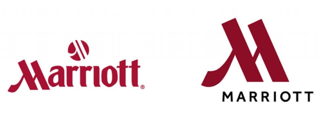
1. Marriott

Why it Works: Marriott’s refresh is effective because it keeps the two most recognizable parts of the old logo — its color and the instantly recognizable M. But at the same time, it modernizes the font, taking it from ’80s nostalgic to modern and fresh.
2. YouTube

Why it Works: Like Marriott, YouTube keeps its existing colors intact for an end result that looks new and familiar at the same time. The brilliance in the brand’s logo shift is that it simultaneously reimagines its recognizable red rectangle from a television to a play button, while juxtaposing the two halves of its name together. This reflects both the change in media consumption habits (many Gen Z kids have never even seen a traditional TV, let alone heard the slang tube) and the enormous brand recognition YouTube has gained since its original logo was introduced.
3. eharmony

Why it Works: Online dating site eharmony makes two relatively major changes and two smaller ones in its refresh. The biggest shift is the lowercase h to de-emphasize the e at the word’s beginning. The second big change is the addition of a heart icon to spotlight the brand’s goal: helping users find love. Combined with a slight shift to make the color more on-trend (while throwing a subtle nod to the original brand color in the heart) and using a more modern font, these changes work seamlessly together. The new logo is instantly recognizable and yet much more contemporary, proving that seemingly subtle changes can go a long way.
4. Peace Corps

Why it Works: The Peace Corps took the most recognizable part of its identity – the dove – and let it be the hero of its updated logo. The red, white, and blue color scheme remains unchanged, but the refreshed font gives the brand an entirely new look. Note that both elements of the logo can stand on their own: The dove circle shines as a great icon for social profiles, while the wordmark works by itself when the brand needs a simple one-color solution.
5. Audi

Why it Works: Audi’s logo is another example of a brand simplifying something that’s already working. The four interlocking rings are synonymous with Audi, so changing them would be a mistake. Instead, the brand went with a flat, one-color version of its iconic chrome design. Not only does this change make the logo easier to reproduce across various advertising locations (web, print, billboards, etc.), it’s also a subtle nod to the fact that the Audi brand is about more than just cars and SUVs now. Like all good brands, Audi strives to be a way of life.
Now it’s your turn.
Thinking about updating your company’s brand? Before you hire a professional to help, ask yourself the following questions about your logo.
- What’s working well with my current logo?
- What, if anything, will I keep the same or similar so my customers can still readily identify my brand?
- What steps need to be taken to modernize my logo?
When answering these questions, inspect your logo’s colors, fonts, and icons individually. Contrast each with modern logos that you love, in order to gauge how they feel in comparison. It can be helpful to seek input from colleagues or customers. Once you have an idea of your answers, review them with a pro, who will use your input to help create a new look you’ll love. Remember: Sometimes a small change can make a big difference.
Is there a logo redesign you love that isn’t included on this list? Tell us what you love about it below—then tune in to Apple logo designer Rob Janoff’s master class on Wednesday, 3/28!
The post 5 Great Logo Redesigns from the Past 5 Years appeared first on .

