Serving as your company's virtual front door, this page is responsible for drawing in a majority of your website's traffic. Still, despite its prominence, many businesses struggle to optimize it properly.
You see, your homepage needs to wear a lot of hats. Rather than treating it like a dedicated landing page built around one particular action, it should be designed to serve different audiences, from different origins. And in order to do so effectively, it needs to be built with purpose. In other words, you'll need to incorporate elements that attract traffic, educate visitors, and invite conversions.
To improve the performance of your homepage, check out these elements every homepage must have.
12 Critical Elements Every Website Homepage Must Have
Save
Share this Image On Your Site
<p><strong>Please include attribution to http://blog.hubspot.com with this graphic.</strong><br /><br /><a href='http://blog.hubspot.com/blog/tabid/6307/bid/31097/12-Critical-Elements-Every-Homepage-Must-Have-Infographic.aspx'><img class="alignCenter shadow" src='http://cdn2.hubspot.net/hubfs/53/homepage-critical-elements-infographic.png' alt='12 Critical Elements Every Homepage Must Have' width='669px' border='0' /></a></p>What You Should Include in Your Website Homepage Design
1. Headline
Within three seconds, a website needs to tell visitors what the business has to offer. That's where your headline comes in. It may only be a few words, but it's one of the most important pieces of copy on your website.
Many types of people might visit your website, and you'll be hard-pressed to find a few words that hit home for everyone. Instead, write your headline to target a third of those people who are most likely to be happy with your product.
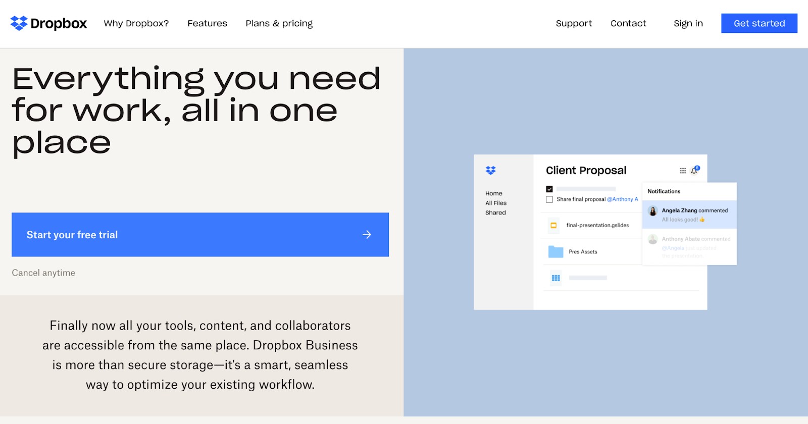
Keep the headline itself clear and simple. Dropbox's headline is a great example: "Everything you need for work, all in one place." It's simple, yet powerful — no need to decode jargon to figure out what Dropbox really does.
2. Sub-headline
Your sub-headline should supplement the headline by offering a brief description of what you do or what you offer. This can be done effectively by zeroing in on a common pain point that your product or service solves.
Here's an example of a great sub-headline from Mirror: "Hiding in plain sight." It hones in on the primary selling point of the mirror gym: It’s a full at-home gym, personal trainer, and workout plan all in the comfort of your home without taking up precious square footage with equipment.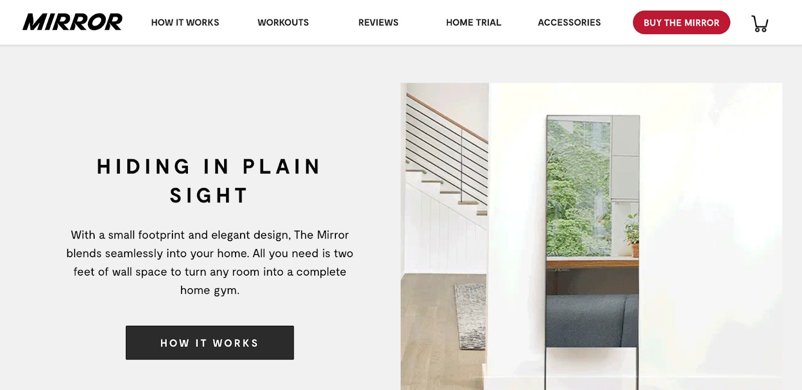
To optimize your headlines for mobile, use larger fonts to give visitors a better experience. Small fonts could force mobile visitors to pinch and zoom in order to read and interact with the content on your site. Our advice? Use the heading options in your page editor. H1 headings are perfect for page titles — there should only be one H1 on a page. Subheadings should follow the order of the hierarchy, H2, H3 ... H6, and so on. You can have several of these headings, just make sure they’re in order. For example, you won’t want to jump from an H1 to an H3 — choose an H2 instead.
3. Primary Calls-to-Action
The goal of your homepage is to compel visitors to dig deeper into your website and move them down the funnel. Include two to three calls-to-action above the fold that direct people to different stages of the buying cycle — and place them in spots that are easy to find.
These CTAs should be visually striking, ideally in a color that contrasts with the color scheme of your homepage while still fitting in with the overall design. Keep the copy brief — no more than five words — and action-oriented, so it compels visitors to click whatever you're offering. Examples of CTA copy are "Sign up," "Make an appointment," or "Try it for free."
Afterschool HQ’s website features two CTAs above the fold, both geared toward program directors who are interested in promoting their after-school programs to families on the site. The note below the longer CTA “Create Your Free Profile” gives visitors the nudge they need to create an account — the first step to becoming an Afterschool HQ provider.

4. Supporting Image
Most people are visual. Make sure to use an image (or even a short video) that clearly indicates what you offer. Use images that capture emotion, drive action, and visually tell the story you’re writing about.
To optimize your images for mobile users, use high-quality images that have a reduced file size. (HubSpot customers don't need to worry about this, as images uploaded to HubSpot's software are automatically compressed. Otherwise, tools like TinyPNG will do the trick.) Also, always add alt text to your images to make them more accessible to visitors who use screen readers and to take your SEO efforts up a notch.
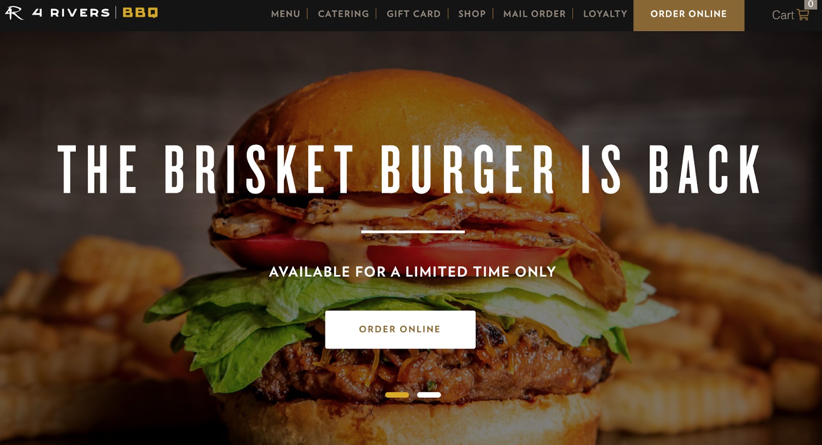
The 4 Rivers Smokehouse homepage is a great example of emotional imagery: It features a series of short, high definition, and mouthwatering videos that play on a loop behind a simple headline, sub-headline, and primary CTA:
5. Benefits
It's not only important to describe what you do, but why what you do matters. Prospects want to know about the benefits of buying from you because that's what will compel them to stick around.
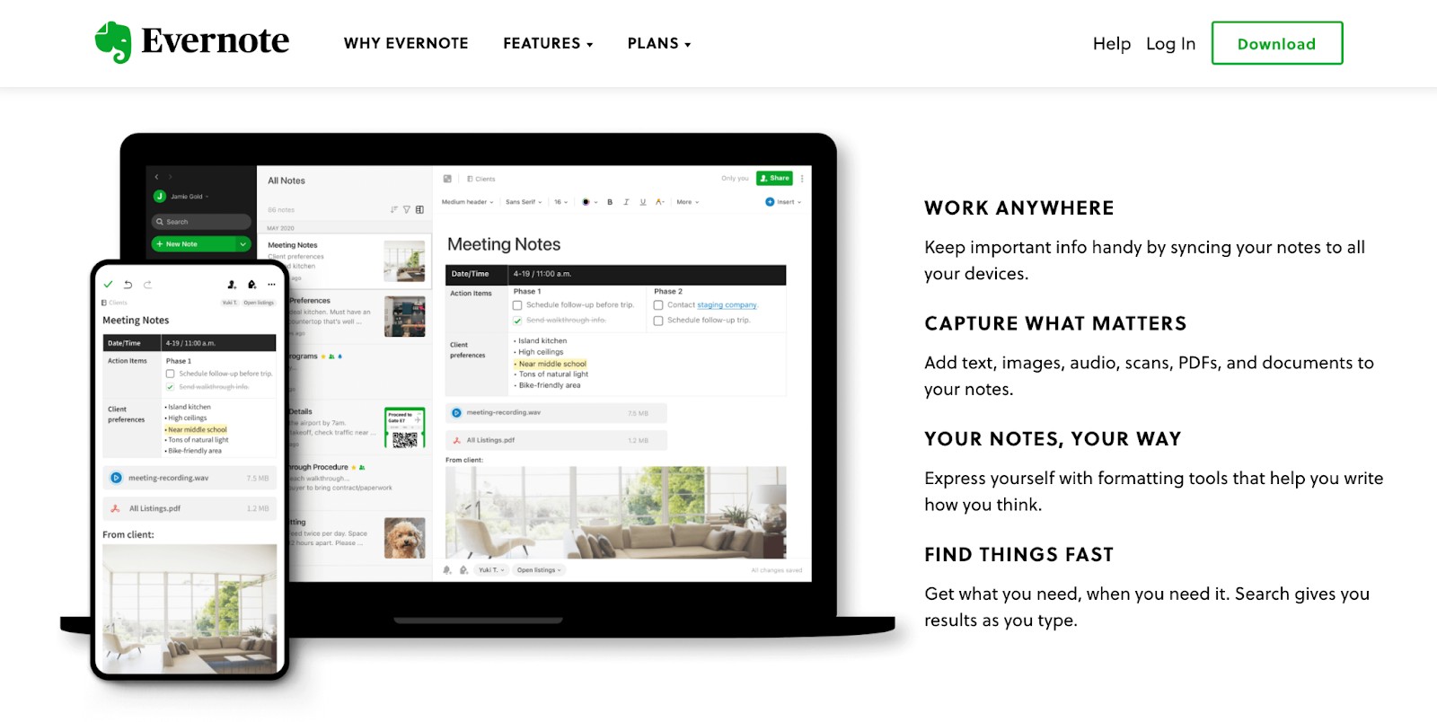
Keep the copy lightweight and easy to read, and speak the language of your customers. Evernote does a great job of listing benefits on their homepage in a way that's compelling, visually pleasing, and easy to understand:
6. Social Proof
Social proof is a powerful indicator of trust. Your product or service could be the best in the world, and it's okay to lay that claim — it's just that people may not believe you unless they hear it from other people, too. And that's exactly what social proof does.
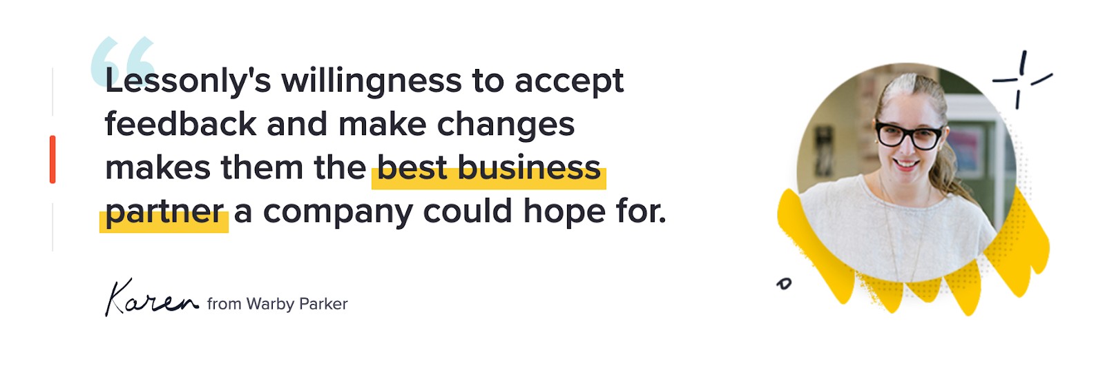
Include just a few of your best (short) quotes on the homepage, and link to case studies if applicable. Adding a name and photo gives these testimonials more credibility. Lessonly nails this on their homepage with glowing testimonials from actual clients.
7. Navigation
The design and content in your homepage navigation could mean the difference between a website conversion and a bounce. To decrease bounce rate, give your visitors a clear path to the pages they need right from the homepage. Make the navigation menu visible at the top of the page, and organize the links in a hierarchical structure.
No one knows your website better than those who helped design it, so be sure to conduct user tests to make sure it's simple and intuitive for visitors to find what they're looking for on your site. Include a search box if you can. (Read this blog post for more helpful website navigation tips.)
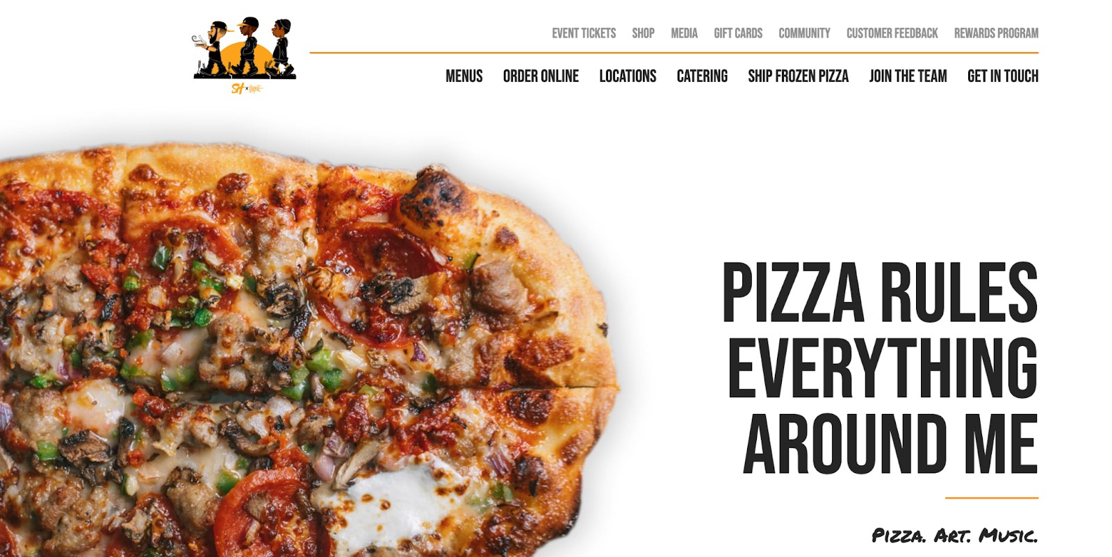
Here's an example of a clear, well-structured navigation design from Slim & Husky’s Pizza Beeria homepage:
8. Content Offer
To generate even more leads from your homepage, feature a really great content offer, such as a whitepaper, ebook, or guide. Folks who may not be ready to buy might rather download an offer that gives them more information about a topic they're interested in. If you need inspiration, here are several different content types to pick from.
9. Secondary Calls-to-Action
Include secondary CTAs on your homepage to offer additional conversion opportunities for prospects who aren't interested in your primary objective. Think of them like the contingency plan: They offer another path for visitors who are not yet ready for something as high-commitment as you're asking.
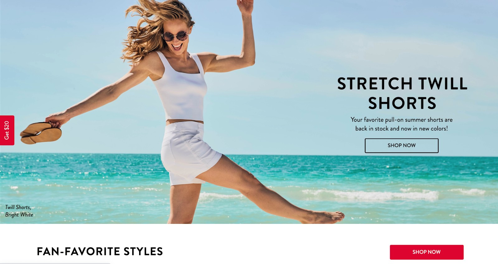
While your primary CTAs should be above the fold, place secondary CTAs below the fold to give visitors things to click on when they scroll down. For example, below the fold on Spanx’s homepage, you'll find three, clearly labeled calls-to-action that give folks who've scrolled that far a few more options to click on. These secondary CTAs are for two different types of conversions: one on the far left for $20 off and another, “shop now” to explore the online catalog.
10. Features
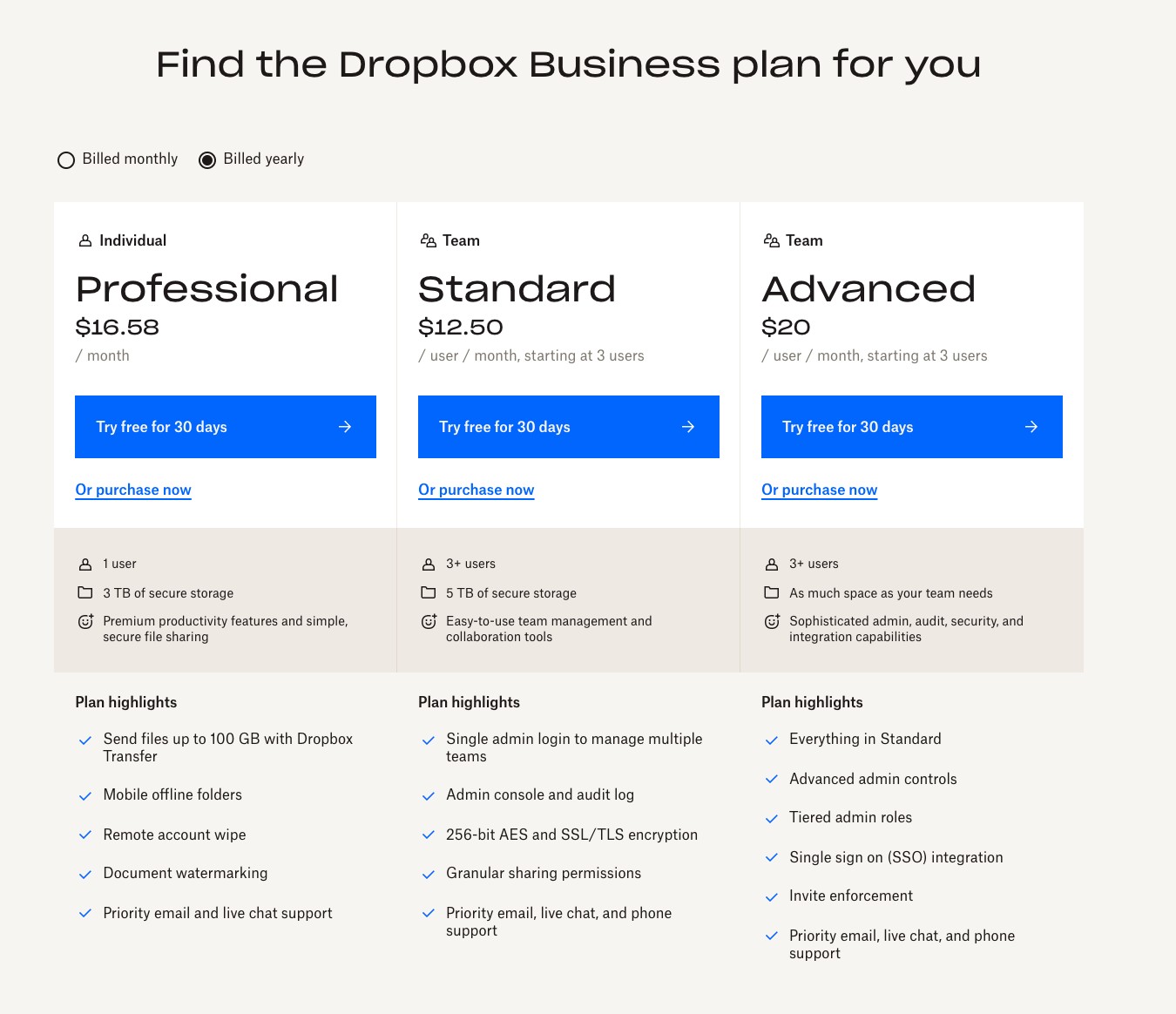
In addition to benefits, list some of your key features. This gives people more of an understanding of what's provided by your products and services. Again, keep the copy light and easy to read. Dropbox for Business, for example, doesn't shy away from showing off a features matrix right on their homepage below the fold.
11. Resources
Again, most visitors to your website won't be ready to buy ... yet. For folks who are looking for more information, offer a link to a resource center where they can browse relevant information. Not only does this keep them on your webpage for longer, but it also helps you establish your credibility as a thought leader in your industry.
Lovesac adds a resources link to the footer below the fold. Notice how each of these secondary CTAs cover multiple stages in the buying cycle: a credit card link to help customers buy their furniture easily, a fabric swatch guide for those who are still looking for the perfect color before making a purchase, and an online catalog for people who are in the market for new furniture but aren’t yet ready to make a purchase.

12. Success Indicators
In addition to customer success stories, both awards and recognition can also help inspire a good first impression. Is your company a critically acclaimed restaurant? Were you voted best new app this year? Let your homepage visitors know of your accomplishments. Like social proof, it'll give your business more credibility to those who don't know you.
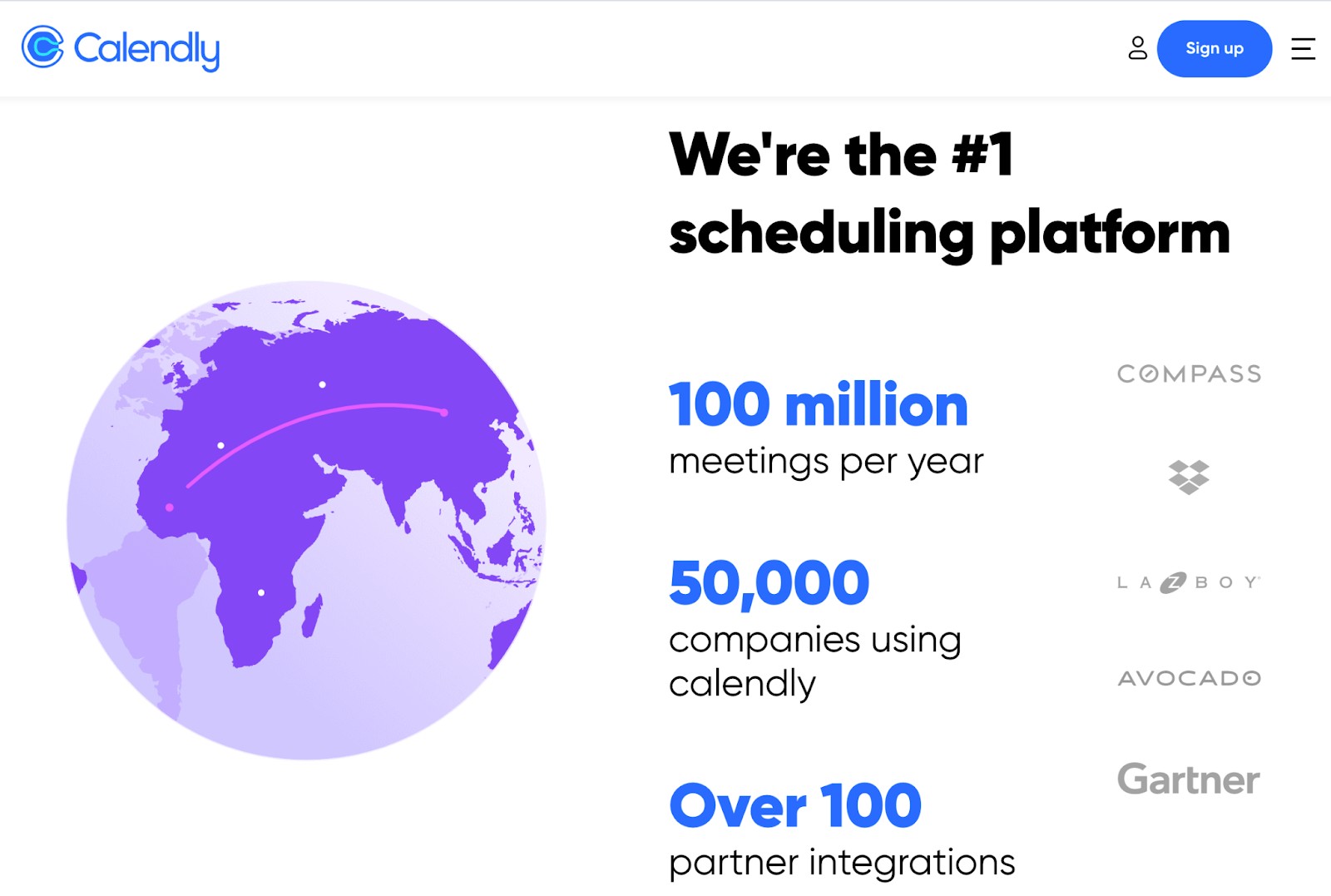
On Calendly’s homepage, for example, you'll find the names of famous organizations that have recognized them, like Gartner and Dropbox.
A Homepage Worth Visiting
The homepage of your site is the first introduction each visitor will have to your business. Before they make up their mind to become a customer, they’ll review your homepage to get an idea of what you sell, why that matters to them, and how they can benefit from what you have to offer.
Make a brilliant first impression with a homepage that incorporates the elements outlined above. And for more inspiration, check out stunning examples of homepages by downloading the free lookbook below.
Editor's Note: This post was originally published in January 2012 and has been updated for freshness, accuracy, and comprehensiveness.
