Did you know it costs five times more to attract a new customer, than to keep an existing one?
Focusing on customer retention is a valuable long-term solution for increased revenue and sustainable growth, but it’s not always easy to cultivate that kind of loyalty.
When I think about the brands I like best, like J. Crew, Spotify, and SoulCycle, I know I’m not a loyal brand advocate because of their products alone. I can get cheaper clothes, music, and groceries from plenty of other places. Ultimately, I’m a brand advocate because I believe in what they promote and I feel invested in their stories, like SoulCycle’s: “We aspire to inspire. We inhale intention and exhale expectation.” I relate to their brand messaging.
One of the ways J. Crew, Spotify, and SoulCycle cultivate customer loyalty is through valuable content. While there are many ways to do this, email marketing is one of the most powerful ways to reach your target audience -- if done correctly.
I subscribe to J. Crew’s email list to get their “Flash Sale: Midnight” offers. I subscribe to Spotify’s newsletter to receive special promotions. And I subscribe to SoulCycle’s emails to hear about unique classes happening near me.
In short, I subscribe to their emails to get value.
If you’re starting from zero, building an impressive email list can feel like an impossible feat. Here, we'll cover some high-quality strategies to build an email list from scratch. Best of all, these strategies are designed to cultivate a loyal email subscriber base, so you can use your emails to attract better long-term customers.
How to Build an Email List From Scratch
1. Create a personalized CTA (call-to-action) for each blog or landing page.
HubSpot has found personalized calls-to-action have a 42% higher view-to-submission rate than calls-to-action that are the same for all visitors -- that’s almost double your potential email subscribers.
It makes sense: the people who visit your blog post or web page are looking for something specific, so your CTA needs to meet those unique needs. For instance, if you’ve got a ton of traffic visiting your “List-Building Strategy” blog article, why not entice those people to subscribe to your email list by including a simple CTA like this: “Click here to download a free list-building toolkit.”
Of course, personalized CTAs only work if you have the resources to create that quality content in the first place, but that process doesn’t have to be expensive or time-consuming. Instead of a toolkit, you could also offer an e-book, a fun quiz, or an exclusive article from your CEO on list-building strategies.
If you offer content directly related to your visitor’s needs, your email newsletter won’t feel like a gimmicky advertisement. Instead, it will feel helpful and valuable -- key principles for a long-term customer retention plan.
2. Create a pop-up or slide-in for each page of your site.
A pop-up might sound initially bothersome, but I’m not talking about those early 2000 pop-up’s that promised you’d “Become a Model NOW”.
Instead, I’m talking about timed pop-up ads, or onsite retargeting. After a user spends a certain amount of time on your page, she can receive a pop-up relevant to the content on that page, or to her behavior. Examples include exit pop-ups, which appear when a user tries to leave the page, or scroll pop-ups, which appear after the user scrolls a certain percentage down the page.
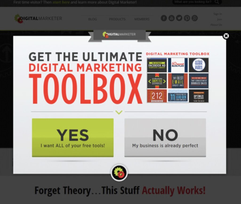
Digital Marketer conducted a case study to determine the value of onsite retargeting. For one experiment in particular, Digital Marketer introduced a pop-up ad to returning visitors only, which appeared after a visitor spent 15 seconds on their site:

Digital Marketer ensured this pop-up didn’t show up if someone came to the page from the newsletter (in which case, they were already signed up), and also didn’t pop-up on a sales page (which could interrupt someone’s purchasing decision).
As you can see, Digital Marketer also took the time to offer meaningful content, a digital marketing toolbox, in their pop-up ad. With an impressive offer, your pop-up is no longer obtrusive or interruptive -- it’s simply helpful.
Ultimately, their campaign generated 2,689 leads in two weeks, and increased their average time on page by 54%. Pop-ups aren’t always gimmicky, and if done right, you’re able to appeal to your visitor with quality content when and where they need it.
3. Create a timed pop-up survey.
Most people don’t visit a new website and think, “Huh, so where’s the email sign-up form?” Often times, you need your viewers to feel invested in your content before you present them with a request for their emails.
To build your email list, you might want to reach out to visitors on specific pages with surveys related to that content. I’m more willing to answer an “A or B” survey question if I’m already invested in the content -- it feels like a fairer trade-off.
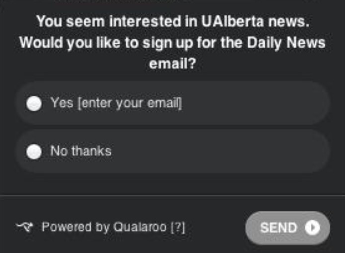
For instance, University of Alberta’s email subscriber list grew almost 500% in one year alone, thanks to a timed pop-up survey they implemented:

The University of Alberta’s pop-up survey only appears after a visitor remains on a news’ page for 10 seconds. At that point, the viewers’ seen some value from the content, so ideally they’re more inclined to sign up for emails from the source.
The University of Alberta’s survey pop-up is also one of the easiest forms I’ve ever seen. You enter your email and you’re done. People are often deterred from signing up when the form is too long and they don’t have the time, so a simple yes or no question might be your best bet for growing your email list.
4. Use humor or sarcasm in your CTA’s “no, thanks” copy.
We’re so infiltrated with “Yes or No” web offers on a daily basis, we barely see them anymore. To increase your email lists, you might want to try injecting some personality into your CTA copy.
I always pause and laugh when I see a CTA with a small, “No thanks, I don’t want to lose weight,” button underneath a prominent “Yes, sign me up!” link. It reminds me there’s a person behind the button, and, while it’s meant to be a joke, it also incentivizes me to hesitate before clicking “no, thanks”. It’s easy to click “no” when the CTA is “sign up for more emails!”, but it’s a little harder to say no to losing weight or getting richer.
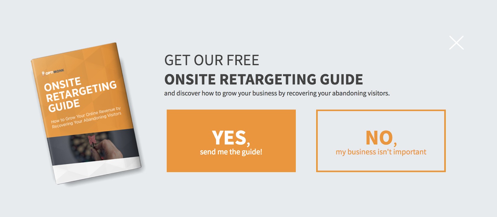
I was reading an Optimonk blog post recently, and this CTA popped up:

I was all set to click “No” without another thought, when I read the “my business isn’t important” part. It gave me pause, made me laugh, and, most importantly, made me reconsider my almost immediate decision to exit the offer.
5. Describe value in your CTA.
We’ve talked a lot about different formatting you might use in your CTA’s (including pop-up ads or personalized offers embedded in blog posts), but what about the language in the CTA itself? You can rely on more than humor and sarcasm to get clicks.
To optimize sign-ups, ironically, you don’t want to use the words “sign up.” Who wants to “sign up” or “subscribe” to more junk emails? Instead, you want to outline the value you can offer upfront, using language like, “Download,” “Featured”, “Exclusive,” “Access.”
For instance, you might write, “Download our exclusive e-book now,” and include an email subscription form, or, you might say, “Access all our exclusive offers.” Both of these CTAs make clear the value you’ll gain from providing your email address.
Your web viewers need to hear how your emails can offer unique and exclusive content that isn’t already available on your website. They want to believe your company is offering something special via email, or what’s the point?
6. Pitch your email newsletter on your social media accounts and email signature.
You might not have a long list of email subscribers, but that doesn’t mean you don't have a network. If you have a following on Twitter, a fan base on Facebook, or businesses you communicate with via email, why not use those firm and loyal connections to build an email list?
You might try pitching an email newsletter on your business’s Facebook, Twitter, or LinkedIn accounts. The people who follow you on those sites already know they like you, but they aren’t necessarily the same people who receive your newsletter. Give them the option.
If you’re uncomfortable pitching your email newsletter on social media, or if you don’t have a large following on any of your accounts, you could also include a link in your email signature -- that link could go directly to your email newsletter, or it could be a link to a blog post or landing page with email subscription CTA’s.
You communicate daily with a diverse group of people via email, and when they get value from your personal emails, they might want the option to click a link and explore your company in more depth.
7. Create more landing pages.
HubSpot conducted research and found companies see a 55% increase in leads when you increase the number of landing pages from 10 to 15.
It makes sense: individual and personalized landing pages allow you to appeal to a wider demographic. Every person who visits your site needs something different, so the more landing pages you can create to answer each person’s individual concerns, the more sign-ups you’ll gain.
It’s like a restaurant menu. The more you can offer to cater for specific demographics, the more customers you’ll bring in. Someone could be looking for the best gluten-free pizza, while someone else might just want some good sushi.
8. Encourage everyone to sign up immediately.
You want to strategically place personalized CTAs where it counts -- on landing pages and blog posts. But what about the rare, but real, visitors who want to sign up immediately?
If your newsletter primarily centers around one or two topics, it’s relatively easy to create a personalized CTA -- simply write a CTA that mirrors your newsletter’s purpose, such as, “Want free SEO hacks? Sign up for our newsletter!”
9. Include a CTA on your About Us page.
Your About Us page is one of the most potent pages in terms of conversion potential. Think about it -- how often do you visit About Us pages for businesses you don’t care about?
Ideally, your About Us page will prime visitors to want more from your business, but it might not be enough to convince them to purchase. A CTA that encourages them to sign up for a newsletter is easier to concede to than a “buy now” plea.
10. Try a scroll box.
Timing is everything. Your call-to-action works best if you catch visitors when they are, in fact, ready to take action.
Figuring out when your visitor is ready to convert depends on your website viewers’ behavior, so you’ll want to conduct A/B testing to determine where you need to place your CTA. Does it work best towards the bottom of a blog page, when it slides out to the right, or does it get higher conversions at the beginning of the page, sliding out from the left?
Ultimately, it will vary depending on your page’s content and your viewers, but a scroll box is a subtle and useful option to help you catch your viewers when they’re most ready to convert.

