If you're a graphic designer, I have to give you praise because, without your creativity and your keen eye for design, it would be a struggle for marketing to create campaigns that catch their audience's attention.
And what better way to show my appreciation to graphic designers than to write a post with helpful graphic design resume examples and tips that can help you land your next job?
You've come to the right place if you're a graphic designer looking for your next gig or want to refine your resume. Let's dive in!
Graphic Design Resume Best Practices
Graphic Design Resume Examples
Graphic Design Student Resume Examples
Graphic Design Resume Best Practices
Before I get into the graphic design resume examples below, I'm going to break down some best practices you should know when putting your resume together.
Use a clean layout.
Graphic design is a field that naturally attracts creative people like yourself, so you might be tempted to create a colorful, unique layout that shows off your eye for design.
However, your resume should have a clean layout that is easy to read and won't confuse any applicant tracking systems (ATS) your potential employers use.
In her YouTube video, "The Resume That Got Me Hired As A Designer," graphic designer Victoria Gillerlain says a clean layout is the way to go.
"If your resume is hard to read, hard to look at, overly contrasted, or just makes people [wince] when they look at it because it's so overwhelming — that's not good," she explains. "[Recruiters] are probably not going to even bother to look into the content itself, and you want them to look at it!"
Gillerlain uses her own resume as an example of what to do, and she notes the absence of color in her document.
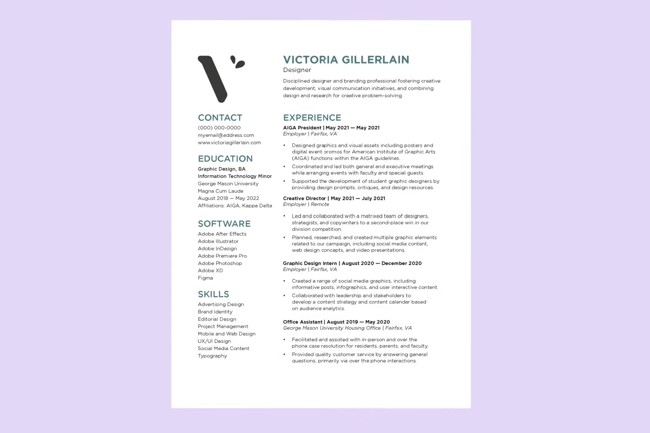
"The reason behind that is that your resume is a professional document, and although you're in a creative field, using this as a creative document—not everyone who is looking at your resume is going to necessarily be in a creative field," she says. "Lots of times, there are going to be HR managers or recruiters who are looking at your resume and have nothing to do with the creative field."
Gillerlain says those people may look at an overly colorful resume and think, "Why does it have so many colors and graphics?"
"On top of that, if you're going to be in an on-site role at all, a lot of times people will print out your resume … there's a chance that none of that is going to actually print, and they might just print it in black and white — so it might now look as you intended it," she says.
Include links to your portfolio.
Even the most well-put-together resume in the world can't replace a glowing portfolio.
So, make sure your resume includes links to your work. Graphic design is a creative and visual industry, and including links to your portfolio will allow recruiters to see your experience and qualifications in action.
Tailor your resume for every application.
This is golden advice for any industry. You should always tweak and tailor your resume for each job you're applying for. This means incorporating keywords from the job posting and highlighting experiences and skills that are relevant to the job.
One graphic design job opportunity may require a skill that isn't as relevant in other opportunities in the industry, and you don't want your resume to leave out that key detail.
So, read the job description closely and tailor your resume so that it applies and sets you up for success.
Mention your education.
"If you have a degree, even if it's unrelated, list it," Gillerlain says. "Having a degree shows that you're credible and committed, and a lot of places like to see that you have one nowadays."
Gillerlain suggests listing your degree, your minor ("If you want," she says), where you got it, and when.
To learn more general resume best practices, regardless of industry, check you my colleague Martina Bretous's post about resume tips that will help you get hired.
Graphic Design Resume Examples
1. Victoria Gillerlain's Graphic Design Resume

I mentioned this resume earlier, but I want to dig a little deeper. Notice how the resume is simple, easy to follow, and to the point.
It's not very colorful but still includes small, unique design elements (like the large V logo in the corner) that help it stand out without being distracting.
Gilerlain also includes a link to her website portfolio, so recruiters can find her work without having to do any additional digging.
Pro-Tip: It's okay to add unique elements to your resume to show your creativity, but keep those elements simple, like in the example above.
Cool-toned colors for headlines and a simple logo can be just enough to separate you from other applicants without overshading the contents of the document.
2. Anna Chen's Graphic Design Resume

The above resume features a minimalist design that keeps the recruiter's focus squarely on the applicant's experience, qualifications, skills, and work history.
Pro Tip: While I like this resume for its simple design, I notice it doesn't include a space for Chen's education history, such as if she has a degree or is actively working toward one.
A simple design is excellent for resumes, but you should still include space for your education credentials.
Also, notice the most recent work experience is not bulleted. Applicants should include bullet points to make their resume more readable.
3. Charles Bloomberg's Graphic Design Resume

This resume is excellent because it's clean and includes all relevant information. I especially love how the applicant made sure to include his education and relevant certifications.
Pro Tip: Notice the small icons at the top symbolizing his location, email, phone number, and LinkedIn.
This information is a must-have, but icons and symbols can confuse applicant tracking systems and can harm the chances of your resume getting the attention of a recruiter.
So, avoid symbols and icons in your resume whenever possible.
4. Clara Thompson's Entry-Level Graphic Design Resume

This resume includes a pop of color that catches the eye without distracting from its contents. Thompson's contact information is listed neatly in the upper right corner of the page, leaving plenty of room for her work experience.
What I Love: The resume is an excellent example for individuals just starting their careers. I love how it highlights relevant projects the applicant completed before freelance work.
5. Samantha Angel's Senior Graphic Designer Resume Example

I'm biased because purple is my favorite color, but this is one of my favorite examples. Samantha's resume includes her work experience and a bulleted list of responsibilities. It also features her activities outside work and degree, adding more legitimacy to her application.
Pro Tip: Like Samantha, consider adding activities and certifications you've completed outside of your career to beef up your resume and show you're a well-rounded candidate.
Graphic Design Student Resume Examples
If you're a student trying to break into the graphic design industry, here are some examples to get you going in the right direction.
1. Minimalist
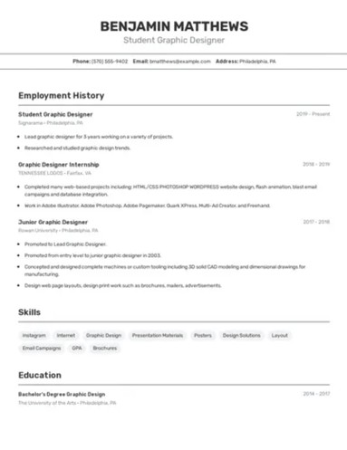
The sample resume is an excellent example for graphic design students looking for entry-level opportunities. If you're new to the field but have internship or volunteer experience that applies to the role, include them as your work experience.
What I Love: The resume is simple and clean, with nearly all relevant information listed.
2. Black and White
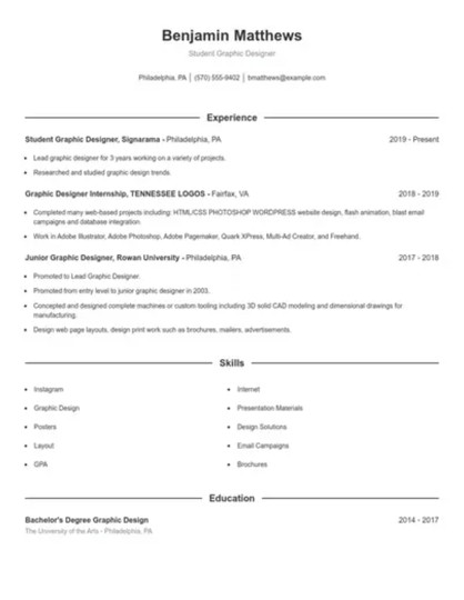
Like the previous example, this resume lacks color—that's okay! As I mentioned earlier, it's not essential to have color. A pop of color can show you creativity, but there's no guarantee a recruiter or hiring manager will see it or care.
What I Love: I can't emphasize enough the importance of having a clean, easy-to-read resume. This format will pass ATS without issues and neatly display your qualifications.
3. Traditional with a Pop of Color

If you want a pop of color in your resume, this example is an excellent template to emulate. It showcases the applicant's creative flair while highlighting all the essential information.
However, be mindful of adding odd symbols and icons. Again, they can pose a problem for ATS.
Pro Tip: If using color, use it sparingly and pick a color that isn't too jarring. Like the one in the example, a calming blue is a great choice.
Graphic design, like most creative fields, can be a harsh industry to break into. However, you have the best chance if you have a portfolio, skills, experience, and a clean resume to vouch for you. Good luck!

