At HubSpot, we're constantly A/B testing conversion path elements — landing pages, calls-to-action (CTAs), and emails — to see how we can generate more leads, MQLs, and customers.
Having CTAs throughout your website and blog will certainly help your website visitors find your conversion pages. But are your CTAs effectively capturing people's attention?
Try to guess which of these two CTAs had the higher conversion rate.
Here's CTA #1:

Here's CTA #2:

Ready for the answer?
The winner was #2.
And I bet some of you guessed that the winner was #1. The truth is, you won't know which CTA is the better performer until you test it — so you've got to get started with testing now.
In that spirit, here are 10 tests you can run on your own website to try to increase click-through-rates.
- Test the color of your CTA buttons
- Test text vs. image
- Test the placement of your CTA
- Test static vs. motion-based CTAs
- Test different copy
- Test the button size
- Test time-sensitivity
- Try first, second, and third person points of view
- Personalize CTAs
- Use white space
1) Test the color of your CTA buttons.
Many companies are afraid to go off-brand with the color schemes on their websites. But are your CTA buttons blending in too much with the rest of the page? That might be the case. Test using bolder colors that clash with your regular stylings — it may not be "pretty," but at least you'll get people's attention.
Here are a few download buttons in different colors you can save and try on your website. Click here to download the full set of 140 CTA buttons.
2) Test text vs. image.
Would your website visitors respond better to a text CTA versus an image CTA? There's only one way to find out. Test it! Here's an example of three CTAs we're testing on one of our blog posts right now:
The first variation looks like plain text, with an image download button included. It looks as though the text is part of the blog post itself, rather than an "ad" or "call-to-action."

The second variation is obviously a "call-to-action," and there's a separation between the content of the blog post and the content of this CTA because it clearly looks like its own image.

3) Test the placement of your CTA.
On your website pages, your CTA should be above the fold — near the top of the page so visitors don't have to scroll down to see it. Traditionally, many blogs have CTAs at the very bottom of each blog post. However, readers don't always reach the end of an article they're reading. In fact, most readers only get 60% through an article.
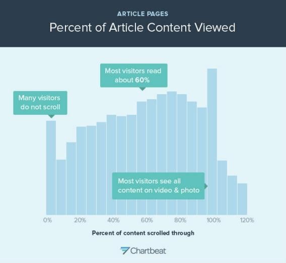
If this is the case for you, perhaps it's time to test different placements of CTAs on your blog posts and website pages.
With HubSpot's CTA tool, you'll be able to unlock plenty of customization options, including placement.
Get started with HubSpot's CTA tool
4) Test static vs. motion-based CTAs.
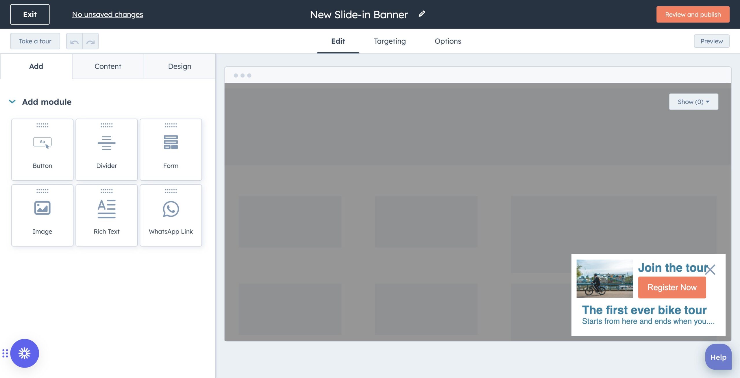
See that CTA slide-in just now? You probably did, because something on the page just changed. People are accustomed to seeing ads on websites now, so their eyes glaze over static images that stay in one place. So perhaps you could test a CTA that slides in when the user reaches a certain point on your page or blog post, and compare the clickthrough rate to the static CTA you've always had on the page.
If you're interested in testing out a slide-in CTA on your blog, here are some easy-to-follow instructions.
5) Test different copy.
Which words will entice your audience to take action more? For example, there are so many different ways to say that you can "download" a piece of content:
- Download this ebook
- Get this ebook
- Receive this ebook
- Snag this ebook
- Grab this ebook
- Claim this ebook
- Buy this ebook
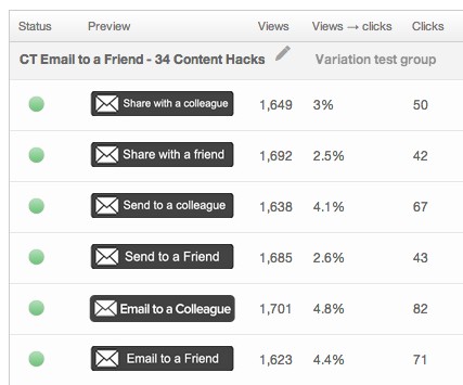
Even the smallest changes can make the biggest impact. Don't believe me? Check out our results from this CTA test in which the only difference is a few simple words:
HubSpot's CTA tool enables you to generate and edit CTA copy with AI-powered writing software, currently in public beta.
6) Test the button size.
If your CTAs are too small, they might go unnoticed on your website.
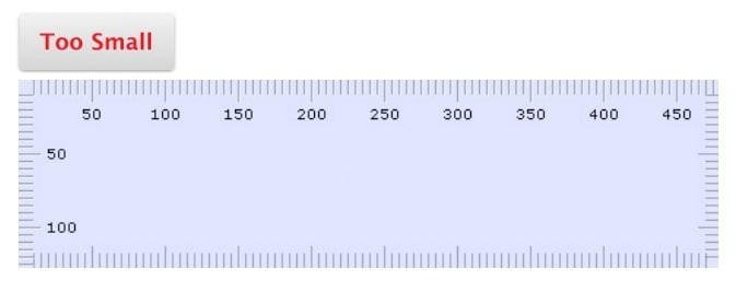
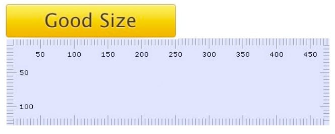
If you're unsure what CTA size will work best for you, test different sizes. Remember, you won't know what works best for you and your website in your industry with your audience until you test it for yourself.
7) Test time-sensitivity.
Test telling people to do something right now. One way to do that is to add words like "now" or "today" to your CTA button to add an element of urgency. Reminding people to do something now can increase the chance of them actually doing it now.
8) Try first, second, and third person points of view.
Testing the different points of view can make a difference. For example, you can run a test using first and second points of view. A first-person CTA can read "Reserve my seat" while a second-person CTA can read "Reserve your seat."
9) Personalize CTAs.
Personalize CTAs to your audience with HubSpot's CTA tool
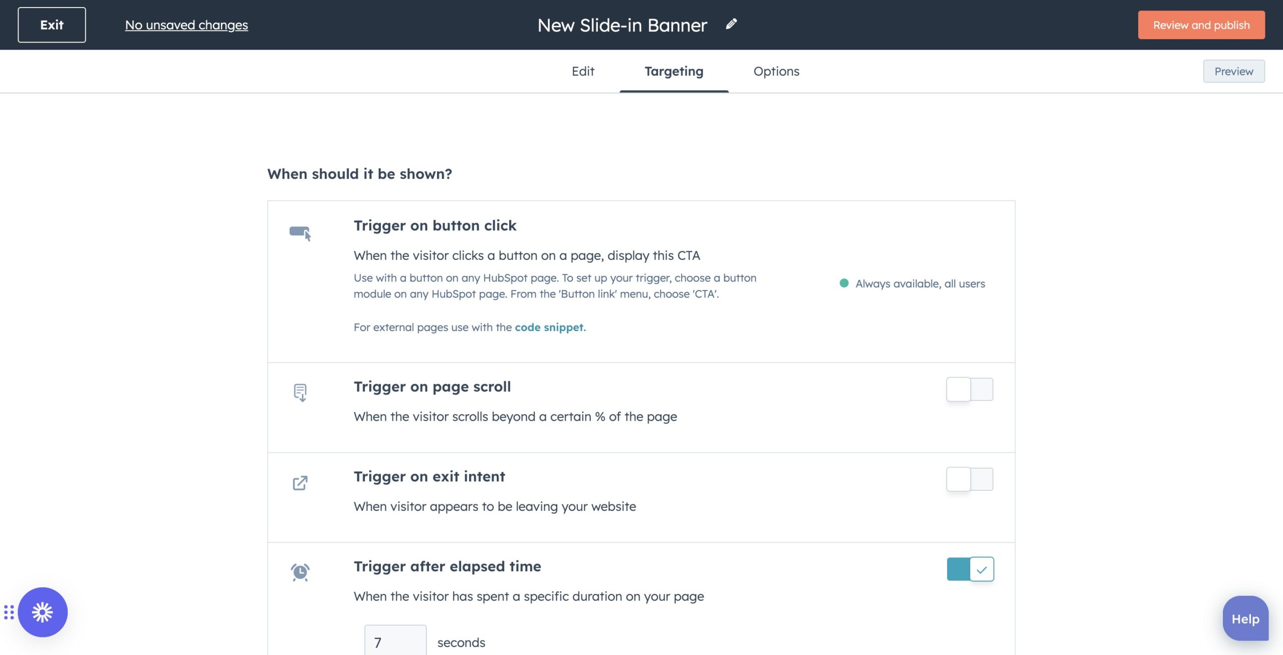
CTAs perform better when they are tailored to your audience — according to HubSpot's research, personalized CTAs perform 202% better than basic CTAs.
Leverage the targeting powers of HubSpot's CTA tool. You can use custom targeting to show the right message to your desired audience at the optimal time. Get granular by tailoring CTAs to anonymous and first-time site visitors based on their location, device, referral source, or preferred language.
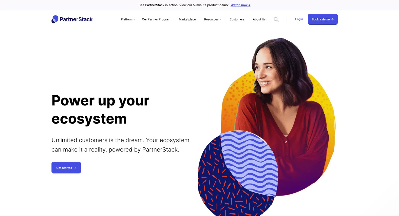
10) Use white space.
You don't want your CTA to get lost amid other components on your page. Strategic use of white space is a great way to increase your CTA's visibility.

HubSpot's free CTA tool enables you to create CTAs without any coding knowledge.
Once you run your tests, you can use our handy A/B test calculator to determine the winner of your test, and whether or not the results are statistically significant. This will let you know if you can declare a definitive winner.

