As we continue social distancing and quarantining to help stop the spread of COVID-19, many of us are looking for new at-home hobbies, activities, and distractions. Nothing pairs as well together as an online cooking class and a classic movie.
We’ve compiled a list of our favorite classics to help you get started, introducing “Fiverr’s 10 Classic Films You Didn’t Have The Time To Watch – Until Now.” Our list features fresh redesigns of the original film posters by Fiverr designers from across the globe, their inspiration behind their design, and what the film means to them (see below).
From dramas with social commentary like Metropolis and The Graduate, to comedy classics including Monty Python and the Holy Grail and Mean Girls, to films that have stood the test of time like Casablanca and The Wizard of Oz, this list of classic films has something for everyone.
Which films do you plan to watch? Check out their work below and let us know what you think in the comments!
Fiverr’s 10 Classic Films You Didn’t Have The Time To Watch – Until Now
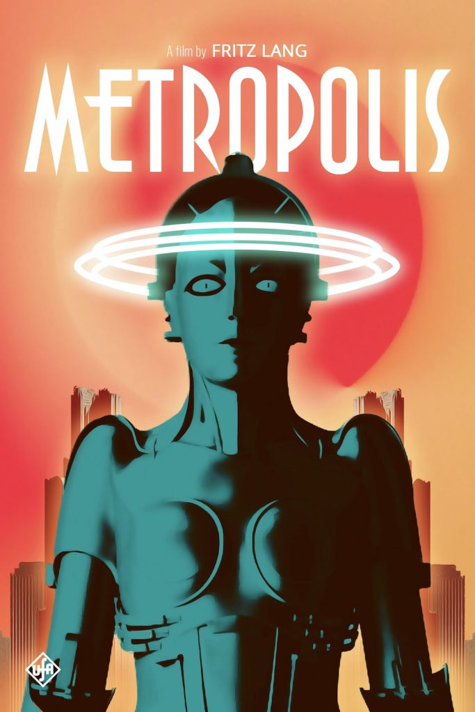
1927: Metropolis

“One thing I liked about the original poster is the simplicity of it. It’s also quite striking. My idea for this design was to update that poster with a slightly modern twist. I kept the minimalism aspect of the design but added some color. One of my favorite scenes in the movie was the transformation. The halo effects used to illustrate the transformation process was pretty cool for the time this film came out. If this came out today, I think the cool neon effect would make sense.” – boxofwolves, Canada
1939: Wizard of Oz

“The Wizard of Oz is a childhood classic for most people, myself included. Something I always go back to, personally, was how the Great Oz ending up being a con artist. The “rewards” he presents them with are metaphorical and Dorothy’s compassion is actually what helps them reach their true potential. My inspiration comes from me wanting to re-imagine the movie as a dark fantasy and to have Dorothy look more powerful than she was originally portrayed. I mainly used the video game series Dark Souls as a style/concept reference. I am a huge fan of the Dark Souls franchise and wanted to pay homage to that as well.” – tamajoshi, USA
1942: Casablanca
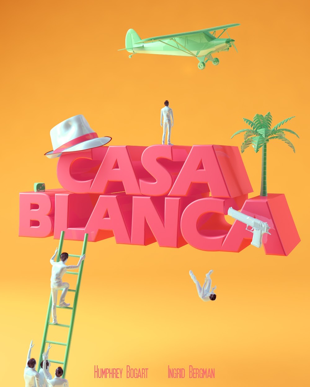
“As an artist who’s based in Morocco, 200km away from Casablanca where the movie is taking place, I was amazed by the story, people’s lives and every aspect of the movie since I watched it for the first time. I had so many ideas regarding the poster, but the story in the movie and the characters seemed to be playing a game, the game of flying away from Casablanca for a better future, a game of conflict and hope as it’s illustrated as a toyish representation.” – chafisart, Morocco
1954: Seven Samurai
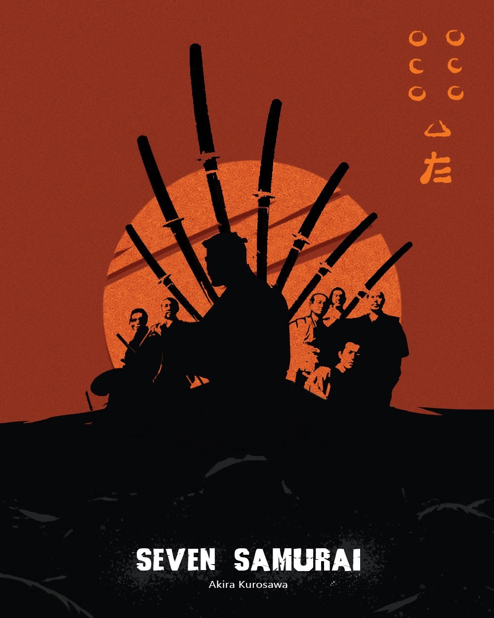
“I wanted to express their devotion and effort by the warmth of the blazing sunset to represent the seven samurai with their swords.” – shineunhye, USA
1967: The Graduate

“The concept focuses on the protagonist Ben (The Graduate), who is questioning his whole life and the reality that surrounds him that no longer belongs to him. As you can see, he is a character without a face and identity, because he has yet to find his way and is fearful of the future. The k-visual is lonely, it tends to isolate itself from reality as when it is dressed as a diver, or it dives into the pool or tries to isolate itself from the bourgeoisie at the beginning, it lacks oxygen and breath. The white space represents its past and present: the bourgeoisie is its family. A society that imposes repetitive rules and linearity (study, get married, work).” – andelby, Italy
1975: Monty Python and the Holy Grail
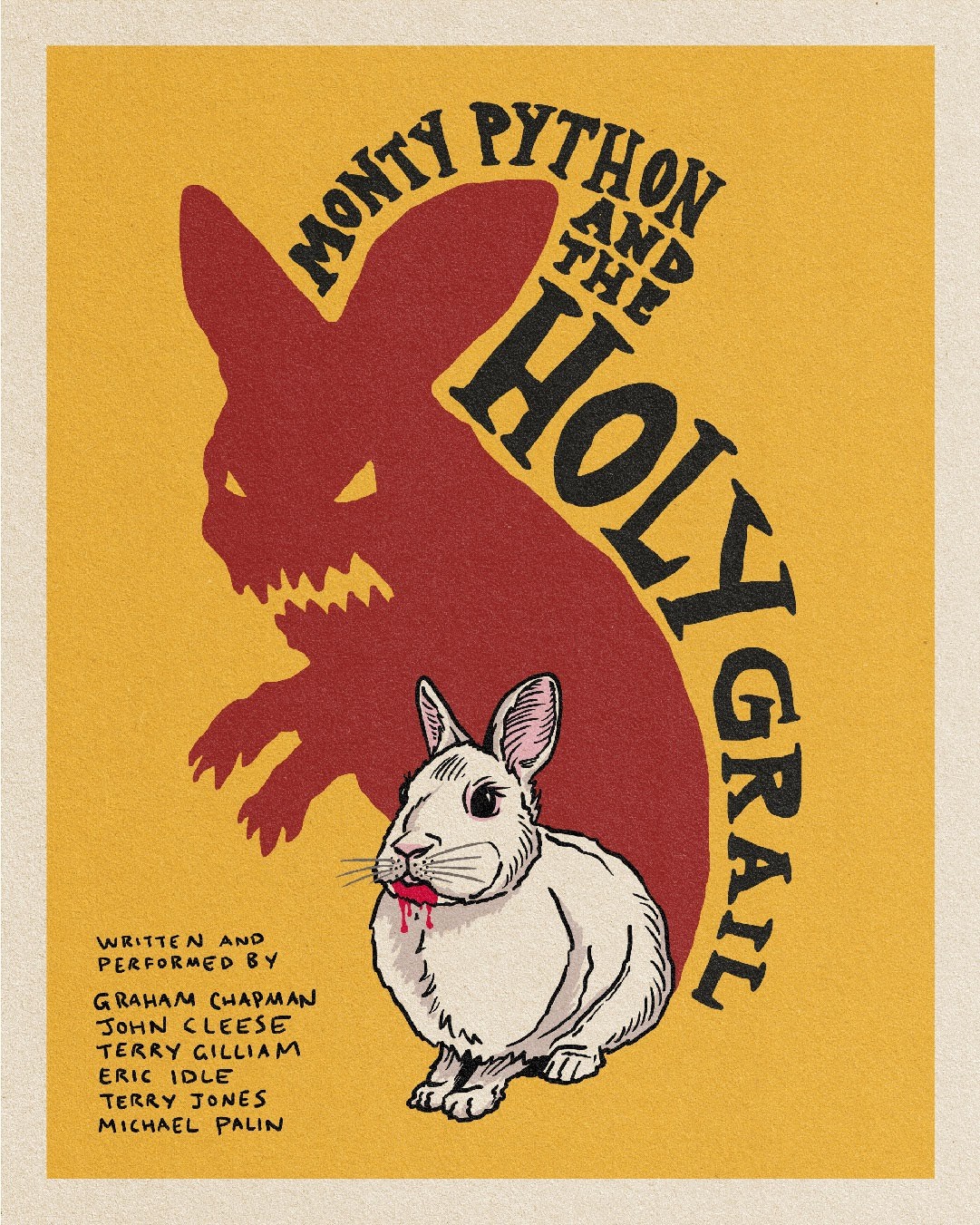
“Think British comedy, and more than likely the two words that pop into your head will be ‘Monty Pythonʼ. Raising funds through their high profile rock n roll musician fans, they started work on the retelling of the legend of King Arthur. Thankfully for us, they couldnʼt raise quite enough money to include real life horses in the film, thus leading to the genius inclusion of using coconut shells as the sound of horse shoes. Just one example of the balance they strike between brilliance and stupidity. There will never be another group that transcends all generations quite like the Monty Python. And remember, if you ever get your arm chopped off by a medieval swordsman…ʼtis but a scratch.” – buckeyedesign, United Kingdom
1989: Do the Right Thing
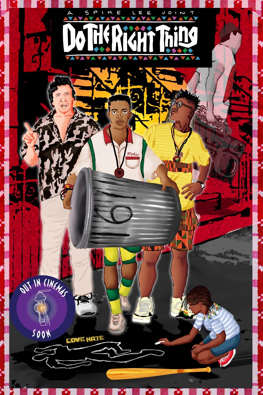
“There is still a huge gap of artistic content depicting people of colour. As an artist who specialises in creating art of African heritage, it was a natural choice for me to illustrate all characters on the movie poster so that the final artwork essentially would be an African American art. ‘Do The Right Thing’ has several protagonists and the cover could have several of them. The choice of adding the character ‘Bugging Out’ and the ghost of Radio Raheem exiting the scene with his boom box seemed to add a more contemporary feel to the artwork for the poster.” – vivuwa, Nigeria
1994: Shawshank Redemption

“To me, The Shawshank Redemption is all about “salvation lies within” and the fight to maintain a sense of self. My design wants to showcase that true redemption is to believe in oneself. The true salvation for Andy Dufrense was his faith in himself, his hope for himself and his belief in himself. Using the symbols that represent “freedom” and “escape” in the movie, I organize them into a cross figure to highlight how the religious theme is running throughout the movie but the key to “salvation” lies within the characters’ faith in themselves. Once freedom is archived, only the one who believes in themselves, survive.” – thisisivy, USA
2004: Mean Girls

“The storyline includes stereotypes, metaphors for the problems of dictatorship and power, an analysis of the mechanisms of political technology, rebellion and revolution, and even allegories of Orwell’s “Animal Farm”. Deep questions about the nature of power, its toxic effects on man and the society around him. An amazing feature of the film is its timeless readability. And it can, without hesitation, be described as one of the main advantages. In addition to the extremely deep allegories of dictatorship, we also have a direct reference to a moral abstraction that can lead to extremely unfortunate consequences. Added to the top is a discussion of the nature of rumors and their impact on the individual, the theme of teen bullying and its silence.” – christinarobin, USA
2010: Inception

“I chose one of the main symbols of the film and added to this idea some freshness. That’s why I decided to play a little with the gradient background which should represent the dream world.” – ellenasm, Czech Republic
The post 10 Classic Film Posters Reimagined appeared first on .

